Data Types
Mythradon supports many different data types. Data types define the type of field that you can use in a form.
i.e., Picklist field, Free Text field, Date field etc
Most data types are available for use in the Entity Manager for creating custom fields. There are several Special Data Types that are not available directly in the Entity Manager. If you need to use one of these additional types, please contact Mythradon Customer Support for assistance.
Standard Data Types
| Type | Description |
|---|---|
| Address | The Address data type is designed specifically for the entry of addresses. It is a multi field data type. |
| Array | The Array data type is used to display a list of multiple values, similar to the Multi-Enum field. |
| Attachment Multiple | The Attachment Multiple data type supports the attachment of multiple files. |
| Auto-increment | The Auto-Increment data type is used to a generated read-only auto-incrementing integer number. |
| Barcode | The Barcode data type is used for the display of Barcodes. |
| Boolean | The Boolean data type is used to store a true/false value. It is displayed as a checkbox. |
| Checklist | The Checklist data type is used to display a list of checkboxes. |
| Color | The Color data type is used to select a HTML color code. This supports manual entry of code from #000000-#ffffff or selection from a color pallet. |
| Currency | The Currency data type is used to store and display currency values. |
| Date | The Date data type is used for the storage and display of date values without any time value. |
| Date Time | The Date Time data type is used for the storage and display of date/time values. |
| Date Time with Time Zone | The Date Time with Time Zone data type is used for the storage and display of date/time values with the addition of selecting a time zone. |
| Enum (Picklist) | The Enum data type provides a picklist of values where only one value can be selected at a time. |
| File | The File data type is used to add a single file to the form. |
| Float | The Float data type is used to store decimal numbers. |
| Foreign | The Foreign data type is used to provide a field/value from a related Entity/record. This field will always be read-only. |
| Header Text | The Header Text data type is used to display a header. It can be used on a page layout to separate values with a nicely formatted heading. |
| Image | The Image data type is used to store and display images. The images can be displayed in a variety of sizes. |
| Integer | The Integer data type is used to store and display whole numbers. |
| Map Route | The Map Route data type is used to display one or more addresses on a Google Map display. The addresses that are displayed are other address fields on the same record. In order to use this, you must have at least one other Address data type field defined in the entity. |
| Multi-Enum | The Multi-Enum is used to display a list of multiple values that can be selected from a picklist. |
| Number | The Number data type provides an auto-incrementing number that is of type string. Supports applying a prefix and setting a specific length. |
| Rich Text Label | The Rich Text Label data type is used to display a label that supports HTML formatting such as font type, size and color. |
| Signature Pad | The Signature Pad data type is used to store and display a hand written signature. |
| Text | The Text data type is used to store multiline text with markdown support. |
| URL | The Url data type is used to store links to web pages. |
| Varchar | The Varchar data type is used to store and display a single-line text. |
| WYSIWYG | The WYSIWYG (What you see is what you get) data type provides the user with a rich text multi line data entry field. |
Special Data Types
The following data types are supported in Mythradon, however you will need assistance from Mythradon Customer Service to implement for custom fields.
| Type | Description |
|---|---|
| The Email data type is designed specifically for the entry of email addresses. | |
| Phone | The Phone data type is designed specifically for the entry of phone numbers. The phone data type supports the entry of multiple phone numbers and allows the selection of phone type. i.e., Mobile, Office. |
| Link | A Static link is used to pick a record from the defined entity. i.e., Select a specific Contact or Account. |
| Link Multiple | A Static Link Multiple Data Type is used to pick one or more records from the defined entity. i.e., select a specific Contact or Account. |
| Link Parent | The Static Link Parent data type allows for the selection of a record from one or more different Entity Types. |
| Risk Matrix | The data type is designed specifically for risk management. |
RegEx Validation Patterns
Varchar, Array and Multi-Enum fields support Regular Expression validation via a property called Pattern.
You can enter a regular expression to check the field value against or select one of the following predefined validation patterns.
| Pattern | Description |
|---|---|
| $noBadCharacters | RegEx: [^<>=]+. Allows all letters, numbers and other characters except ^<>=. |
| $noAsciiSpecialCharacters | RegEx: [^~!@#$%^&*()_+={}\\[\\]|\\\\:;\"'<,>.?]+. Allows all letters, numbers and other characters except ~!@#$%^&*()_+={}[]|\:;"'<,>.? to be entered. |
| $latinLetters | RegEx: [A-Za-z]+. Only allows for A-Z both uppercase and lowercase letters to be entered. |
| $latinLettersDigits | RegEx: [A-Za-z0-9]+. Only allows for A-Z both uppercase, lowercase letters and numeric characters 0-9 to be entered. |
| $latinLettersDigitsWhitespace | RegEx: [A-Za-z0-9 ]+. Only allows for A-Z both uppercase and lowercase letters, numeric characters 0-9 and a space to be entered. |
| $latinLettersWhitespace | RegEx: [A-Za-z ]+. Only allows for A-Z both uppercase and lowercase letters, and a space to be entered. |
| $digits | RegEx: [0-9]+. Only allows for numeric characters 0-9 to be entered. This does not allow for decimal places, commas or negative values. |
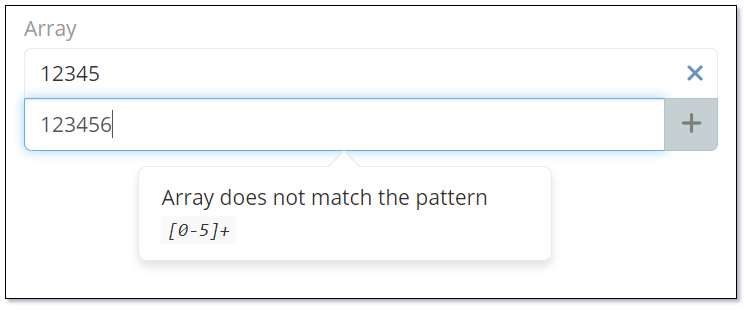
Other Regualar Expression values can be entered. i.e. [0-5]+ will only allow for numeric characters 0-5 to be entered. Values entered that do not match this regualar expression will display the following error message:
Standard Data Types
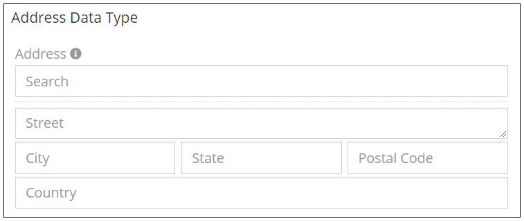
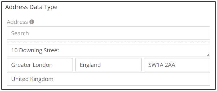
Address
The Address data type is designed specifically for the entry of addresses. It is a multi field data type that will automatically include the following fields:
- Street
- City
- State
- Postal Code
- Country
- Latitude
- Longitude
- Address Map
You can also define which of the above fields are required or mandatory fields when entering an address.
The Address data type also has an optional Google Maps lookup feature and Google Maps display link.
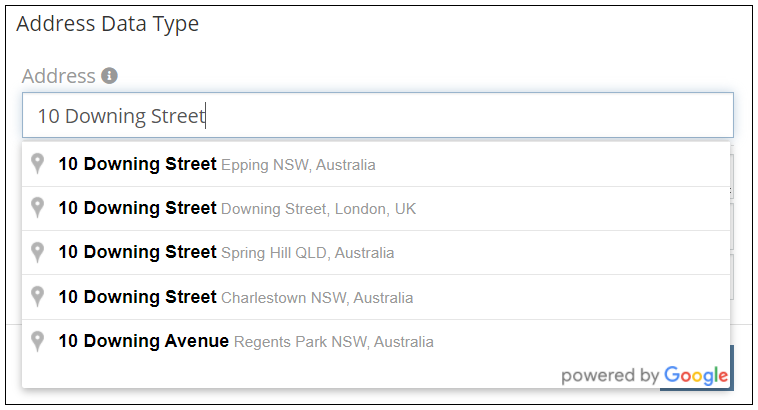
Refer to Google Maps Integration for instructions on enabling the address validation and lookup.
Address Formats
The format of the Address fields can also be controlled as a system setting to support your specific address field layout. The available options for displaying an address are as follows:
| Format | Example |
|---|---|
| Format 1 | Street City, State PostalCode Country. |
| Format 2 | Street PostalCode City State Country. |
| Format 3 | Country PostalCode State City Street. |
| Format 4 | Street City Country - State PostalCode. |
The Address data type supports the following properties:
| Property | Description |
|---|---|
| Name | Name of the field. |
| Label | The display label for the field. |
| View Map Button | Controls if the View Map link is displayed. |
| Required Fields | Allows control of the requiredness of individual fields in the address. i.e. City and State must be required but the street is optional. |
| Enable for Map List View | Controls if the address is available for display in the Map List View. |
| Places API Disabled | Controls if the Google Places API is enabled. If this is enabled you will be presented with an address search box at the top of the address fields. If disabled the address search box is not displayed. |
| Show Coordinates | Controls if the Latitude and Longitude coordinates are displayed for the address. If enabled, these values are displayed at the bottom of the address field by default. |
| Disable Inline Edit | Controls if inline editing is enabled for the field. |
| Required Fields | Selection of the address fields that are required to have data entry. When you add an address field you will This enables you to have a fine |
| Tooltip Text | Popup hint text that will display when you click the information icon related to a field. |
Dynamic logic can be exemplified by how one or more fields' values control the visibility, requirement and read-only status of a particular field.
The Address data type supports the following dynamic logic properties:
| Property | Description |
|---|---|
| Conditions making field visible | Dynamic logic that controls if a field is visible on the User Interface |
| Conditions making field read-only | Dynamic logic that controls if the field is read-only on the User Interface |
| Conditions making field invalid | Dynamic logic that controls the validity of the field. If the field is deemed invalid, the record cannot be saved. |
Array
The Array data type is used to display a list of multiple values, similar to the Multi-Enum field. The Array data type can be configured with or without values (Values in the Options property).
When configured with no Options the user can add or remove whatever values they wish using the (+) button to add a new values or the (x) to remove values.
When configured with Options the user must select one or more of the pre-defined values. In this case the user will be presented with a check list that will allow them to select all the necessary values.
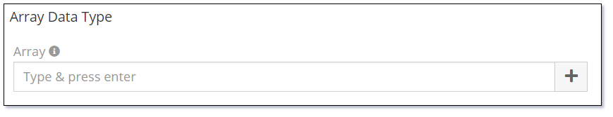
Example 1 - Configured with no Options/Values
The following image shows how the Array data type will display when configured with no Options and the user has not entered any of their own values.
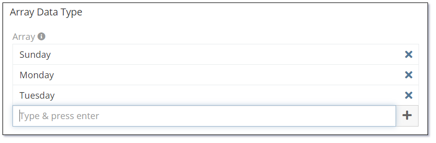
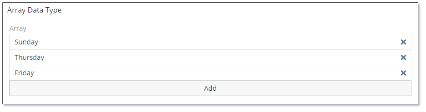
The following image shows how the Array data type is displayed when values have been added. Simply press the (+) button to add a new line and type in the required value or press the (x) to remove a value from the list.
In this case the names of the days of the week have just been manually typed in.
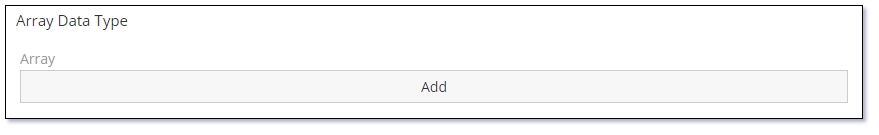
Example 2 - Configured with Options/Values
The following image shows how the Array data type will display when configured with Options. In this case the Array data type field has been configured with the names of the days of the week but none have been selected in this image.
Click the Add button to display the Array data type selection dialog.
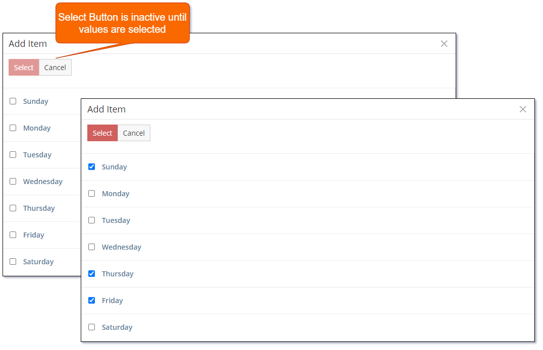
The following image shows the Array data type selection dialog. Select the required options and click the Select button.
The following image shows the Array data type once values have been selected.
To remove selected items use the (x) on the corresponding item. The item will simply be removed from the list. There is no confirmation dialog for this action.
The Array data type supports the following properties:
| Property | Description |
|---|---|
| Name | Name of the field. |
| Label | The display label for the field. |
| Required | Controls if the field is a required field. The field will only be required if it is displayed. i.e., if you are using conditional logic that hides a 'required' field, the 'required' is ignored. |
| Options | A list of values (Key => Label pairs). If no options are specified the user will be able to enter whatever values they want. |
| Empty string value not allowed | Empty string value is not allowed - if not checked, a user can add an empty string as an item. |
| Display As List | Controls if the items will be displayed as a list. |
| Max Item Count | Controls the maximum number of items that can be selected. |
| Pattern | A regular expression to check a field value against. Refer to Validation Patterns for further details. |
| Audited | Controls if changes to the field value will be audit logged in the stream. |
| Read-only | Controls if the field is read-only. |
| Is Personal Data | Controls if the data stored in the field is considered personal data. Personal data is displayed View Personal Data menu item for the record. |
| Disable Inline Edit | Controls if inline editing is enabled for the field. |
| Tooltip Text | Popup hint text that will display when you click the information icon related to a field. |
Dynamic logic can be exemplified by how one or more fields' values control the visibility, requirement, read-only status, specific value display, or validity of a particular field.
The Array data type supports the following dynamic logic properties:
| Property | Description |
|---|---|
| Conditions making field visible | Dynamic logic that controls if a field is visible on the User Interface |
| Conditions making field required | Dynamic logic that controls if a field is required on the User Interface |
| Conditions making field read-only | Dynamic logic that controls if the field is read-only on the User Interface |
| Conditional options | Dynamic logic that controls the available options in the Check list. |
| Conditions making field invalid | Dynamic logic that controls the validity of the field. If the field is deemed invalid, the record cannot be saved. |
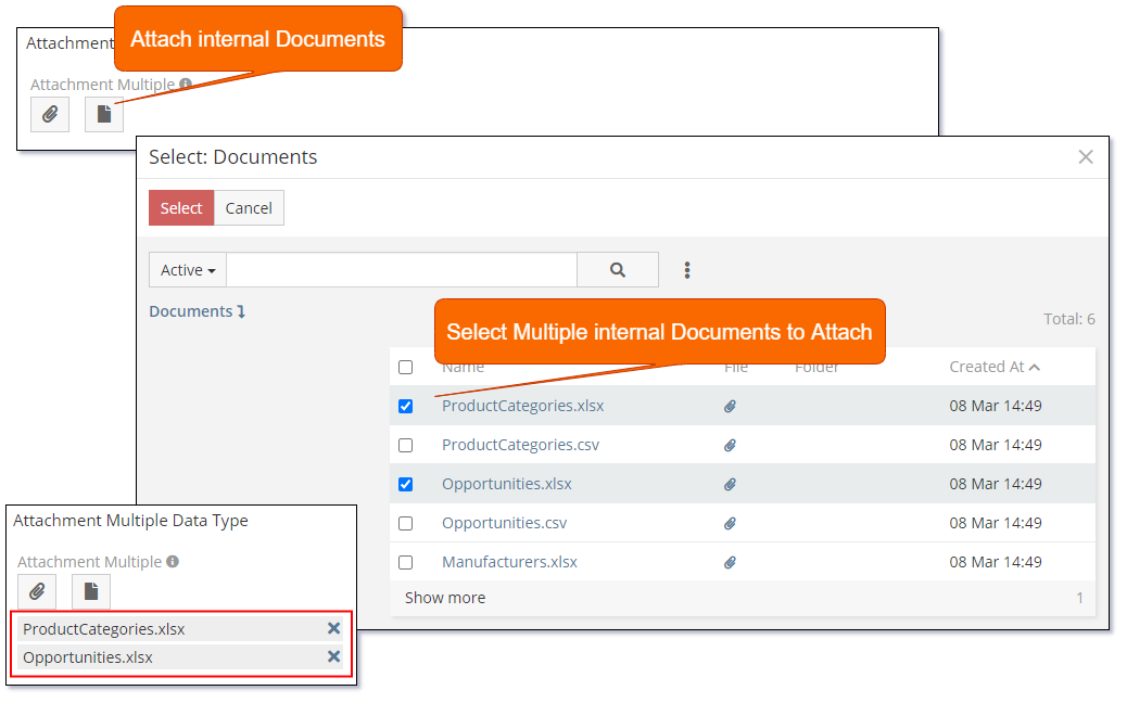
Attachment Multiple
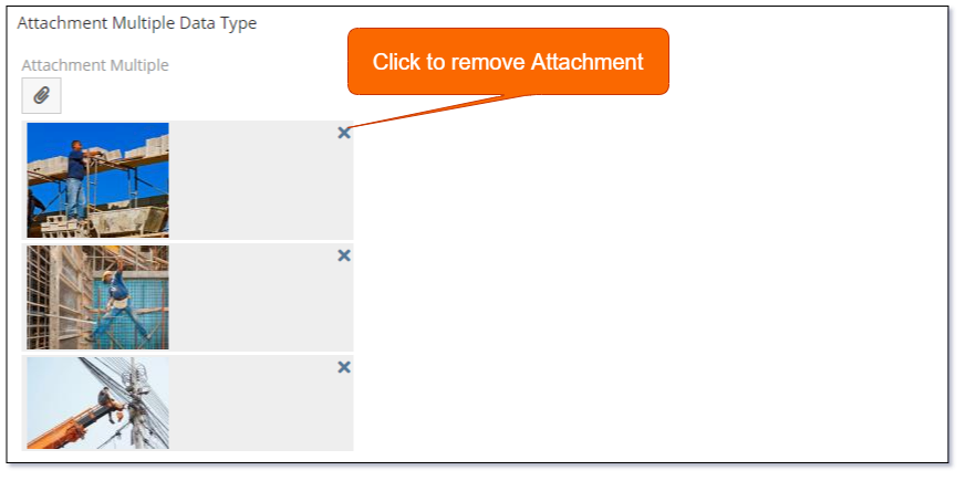
The Attachment Multiple data type supports the attachment of multiple files to an eForm.
The following image shows how the Attachment Multiple data type is displayed when no attachments have been added.


If the file being attached is an image that can be rendered in the browser it will be displayed as a thumbnail image as per the following:
Use the Accept property with a value such as *.txt to provide the default file filter when selecting files to attach. You can define multiple file filters in the Accept property.
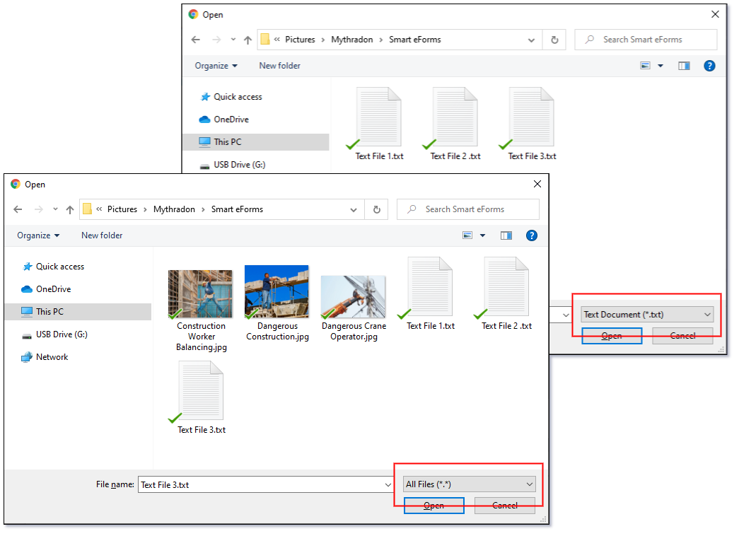
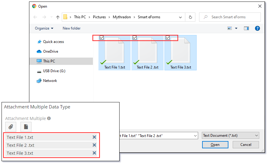
The file selection dialog supports the selection of multiple files to attach in a single action.
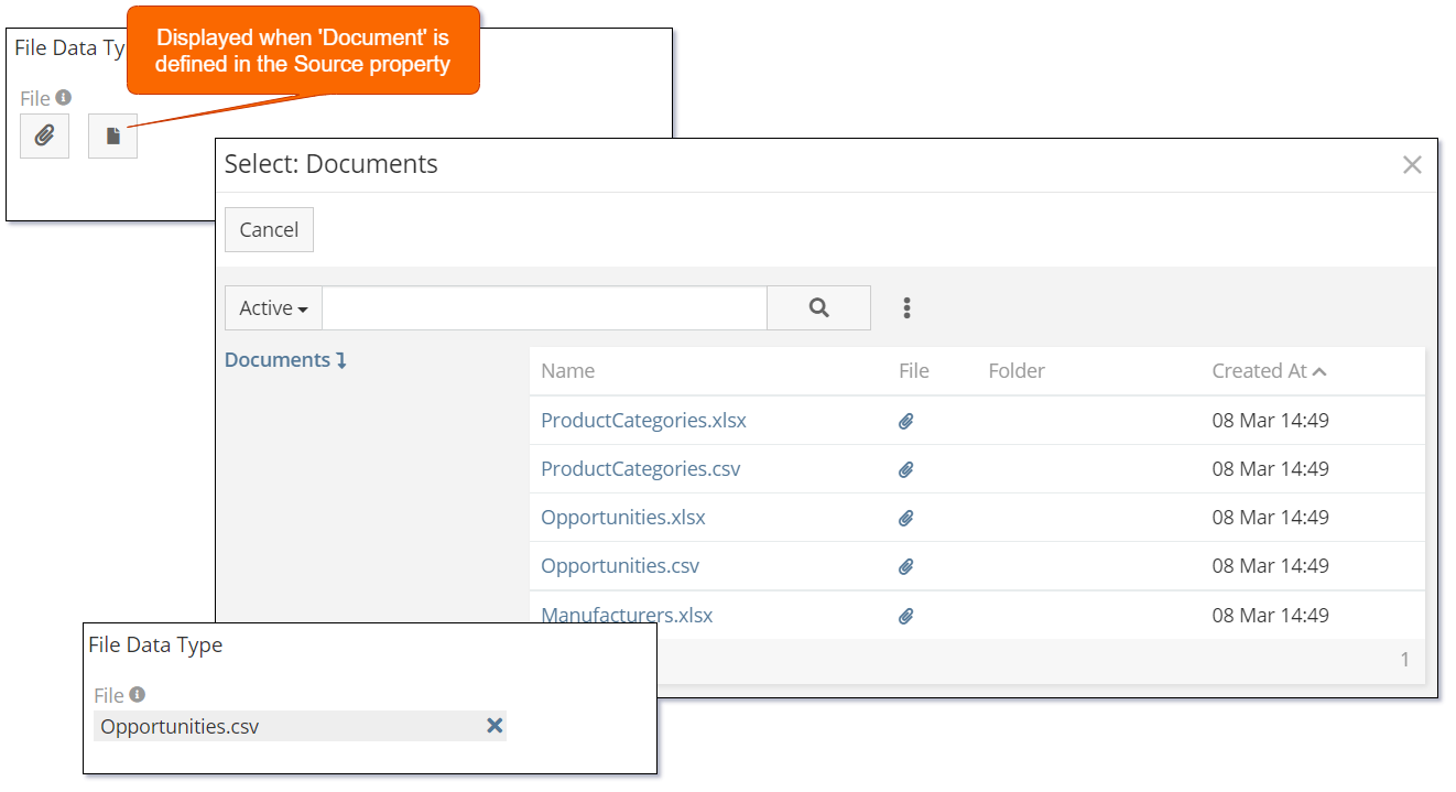
Select internal Documents using the Source property and setting it to the value Documents.
The Attachment Multiple data type supports the following properties:
| Property | Description |
|---|---|
| Name | Name of the field. |
| Label | The display label for the field. |
| Required | Controls if the field is a required field. The field will only be required if it is displayed. i.e., if you are using conditional logic that hides a 'required' field, the 'required' is ignored. |
| Source List | Allows the user to attach a file from another record in the system. Supported Sources are:
|
| Max File Size (Mb) | Allows you to restrict the size of the file that can be attached. Size in defined in Mega Bytes (Mb). If empty there is no enforced restriction. |
| Preview Size | Controls the size of the preview that is rendered on the screen. Supported values are:
|
| Accept | Controls the types of files that can be uploaded. Supported values are:
.txt |
| Disable Inline Edit | Controls if inline editing is enabled for the field. |
| Tooltip Text | Popup hint text that will display when you click the information icon related to a field. |
Dynamic logic can be exemplified by how one or more fields' values control the visibility, requirement, read-only status or validity of a particular field.
The Attachment Multiple data type supports the following dynamic logic properties:
| Property | Description |
|---|---|
| Conditions making field visible | Dynamic logic that controls if a field is visible on the User Interface |
| Conditions making field required | Dynamic logic that controls if a field is required on the User Interface |
| Conditions making field read-only | Dynamic logic that controls if the field is read-only on the User Interface |
| Conditions making field invalid | Dynamic logic that controls the validity of the field. If the field is deemed invalid, the record cannot be saved. |
Auto-increment
The Auto-increment data type is used to generate a read-only auto-incrementing integer number.
The following image shows the only display option for the Auto-increment data type.

Note: If you add a new 'Auto-increment' field to an entity that already contains data, every record will be automatically updated with an auto-incremented value. The records will be updated in the order that they are in the database.
The Auto-increment data type supports the following properties:
| Property | Description |
|---|---|
| Name | Name of the field. |
| Label | The display label for the field. |
| Disable Inline Edit | Controls if inline editing is enabled for the field. |
| Tooltip Text | Popup hint text that will display when you click the information icon related to a field. |
Dynamic logic can be exemplified by how one or more fields' values control the visibility of a particular field.
The Auto-increment data type supports the following dynamic logic properties:
| Property | Description |
|---|---|
| Conditions making field visible | Dynamic logic that controls if a field is visible on the User Interface |
Barcode
The Barcode data type is used for the data entry and display of various types of barcodes.
Mythradon supports the following Barcode standards:
| Barcode Type | Description |
|---|---|
| Code 128 | Code-128 barcodes are used for both alphanumeric and numeric-only barcodes. Wikipedia Code-128 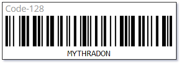 |
| Code 128A | Code-128A barcodes are a variation of the Code-128 that supports ASCII characters 00 to 95 (0–9, A–Z and control codes), special characters, and FNC 1–4. Wikipedia Code-128  |
| Code 128B | Code-128A barcodes are a variation of the Code-128 that supports ASCII characters 32 to 127 (0–9, A–Z, a–z), special characters, and FNC 1–4. Wikipedia Code-128 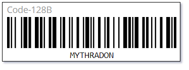 |
| Code 128C | Code-128C barcodes are a variation of the Code-128 that supports 00–99 (encodes two digits with a single code point) and FNC1. Wikipedia Code-128 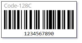 |
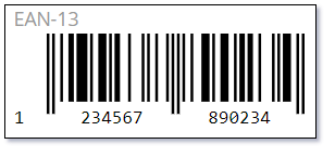
| EAN-13 | EAN-13 (European Article Number) barcodes are 13 digit [0-9] barcodes used on most retail products. These are used internationally as the most common type of barcode, except for the USA and Canada, where UPC barcode is more common. The 13-digit EAN-13 number consists of four components:
 |
| EAN-8 | EAN-8 (European Article Number) barcodes are 8 digit [0-9] barcodes similar to the EAN-13. It is designed for use on small packages where an EAN-13 barcode is too large. Wikipedia EAN-8 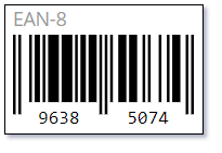 |
| EAN-5 | EAN-5 (European Article Number) barcodes are 5 digit [0-9] barcodes similar to the EAN-13. These codes are designed to provide a suggested price on books. The first digit represents the currency. Wikipedia EAN-5 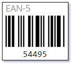 |
| EAN-2 | EAN-2 (European Article Number) barcodes are 2 digit [0-9] barcodes similar to the EAN-13. These codes are designed for use on magazines and periodicals to indicate an issue number. Wikipedia EAN-2 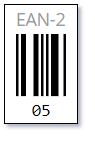 |
| UPC-A | UPC (Universal Product Code version A) barcodes are widely used worldwide for tracking trade items in stores. Wikipedia Universal Product Code 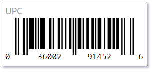 |
| UPC-E | UPC-E (Universal Product Code version E) is a variation of the Universal Product Code version A that allows manufacturers to encode the 12 digits product code in 6 digits. Wikipedia Universal Product Code version E 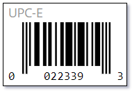 |
| ITF-14 | ITF-14 (International Trade Federation) is a 14 digit [0-9] barcode. Wikipedia ITF-14 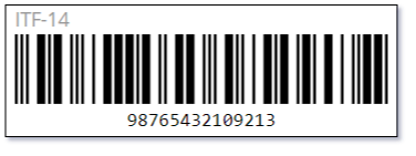 |
| Pharmacode | Pharmacode, also known as Pharmaceutical Binary Code, is a barcode standard, used in the pharmaceutical industry as a packing control system. Wikipedia Pharmacode 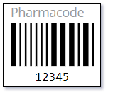 |
| QR Code | QR (Quick Response) codes are two-dimensional barcodes. QR codes often contain data for a locator, identifier, or tracker that points to a website or application. Wikipedia QR Code  |
The Barcode data type supports the following properties:
| Property | Description |
|---|---|
| Name | Name of the field. |
| Label | The display label for the field. |
| Required | Controls if the field is a required field. The field will only be required if it is displayed. i.e., if you are using conditional logic that hides a 'required' field, the 'required' is ignored. |
| Code Type | Barcode Type. Supported values:
|
| Last Character | Used for EAN-13 to define the check digit. |
| Read-only | Controls if the field is read-only. |
| Disable Inline Edit | Controls if inline editing is enabled for the field. |
| Tooltip Text | Popup hint text that will display when you click the information icon related to a field. |
Dynamic logic can be exemplified by how one or more fields' values control the visibility, requirement, read-only status or validity of a particular field.
The Barcode data type supports the following dynamic logic properties:
| Property | Description |
|---|---|
| Conditions making field visible | Dynamic logic that controls if a field is visible on the User Interface |
| Conditions making field required | Dynamic logic that controls if a field is required on the User Interface |
| Conditions making field read-only | Dynamic logic that controls if the field is read-only on the User Interface |
| Conditions making field invalid | Dynamic logic that controls the validity of the field. If the field is deemed invalid, the record cannot be saved. |
Boolean
The Boolean data type is used to store and display true/false values. It is displayed as a checkbox.
Unchecked (False)

Checked (True)

Note: Boolean values are very useful for controlling Conditional Logic on Forms. These can be easier than creating a picklist (ENUM) with 'Yes/No' or 'True/False' string values.
The Boolean data type supports the following properties:
| Property | Description |
|---|---|
| Name | Name of the field. |
| Label | The display label for the field. |
| Default | Default value for the field. |
| Audited | Controls if changes to the field value will be audit logged in the stream. |
| Read-only | Controls if the field is read-only. |
| Disable Inline Edit | Controls if inline editing is enabled for the field. |
| Tooltip Text | Popup hint text that will display when you click the information icon related to a field. |
Dynamic logic can be exemplified by how one or more fields' values control the visibility, read-only status or validity of a particular field.
The Boolean data type supports the following dynamic logic properties:
| Property | Description |
|---|---|
| Conditions making field visible | Dynamic logic that controls if a field is visible on the User Interface |
| Conditions making field read-only | Dynamic logic that controls if the field is read-only on the User Interface |
| Conditions making field invalid | Dynamic logic that controls the validity of the field. If the field is deemed invalid, the record cannot be saved. |
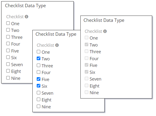
Checklist
The Checklist data type is used to select and display a list of items that selected/unselected using a separate checkbox for each item.
The following image shows how this component looks and feels in three different states. Starting with an empty selection in edit mode, then items selected in edit mode and finally how the items look in display mode.
The Checklist data type supports the following properties:
| Property | Description |
|---|---|
| Name | Name of the field. |
| Label | The display label for the field. |
| Required | Controls if the field is a required field. The field will only be required if it is displayed. i.e., if you are using conditional logic that hides a 'required' field, the 'required' is ignored. |
| Options | A list of values (Key => Label pairs). At least one option is required for this data type to be useful. |
| Is Sorted | Controls if the Options are displayed in alphabetical order. |
| Max Item Count | Controls the maximum number of items that can be selected. |
| Audited | Controls if changes to the field value will be audit logged in the stream. |
| Read-only | Controls if the field is read-only. |
| Disable Inline Edit | Controls if inline editing is enabled for the field. |
| Tooltip Text | Popup hint text that will display when you click the information icon related to a field. |
Dynamic logic can be exemplified by how one or more fields' values control the visibility, requirement, read-only status, specific value display, or validity of a particular field.
The Checklist data type supports the following dynamic logic properties:
| Property | Description |
|---|---|
| Conditions making field visible | Dynamic logic that controls if a field is visible on the User Interface |
| Conditions making field required | Dynamic logic that controls if a field is required on the User Interface |
| Conditions making field read-only | Dynamic logic that controls if the field is read-only on the User Interface |
| Conditional options | Dynamic logic that controls the available options in the Check list. |
| Conditions making field invalid | Dynamic logic that controls the validity of the field. If the field is deemed invalid, the record cannot be saved. |
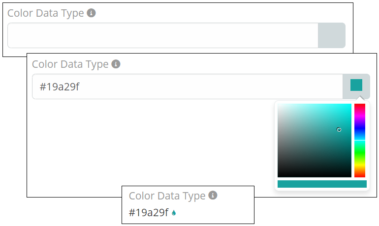
Color
The Color data type enables selection and display of an HTML color code, supporting a range from #000000 to #ffffff. Codes can be input manually or chosen from a popup palette.
The following image shows how this component looks and feels in three different states. Starting with an empty selection in edit mode, then items selected in edit mode and finally how the items look in display mode.
The Color data type supports the following properties:
| Property | Description |
|---|---|
| Name | Name of the field. |
| Label | The display label for the field. |
| Required | Controls if the field is a required field. The field will only be required if it is displayed. i.e., if you are using conditional logic that hides a 'required' field, the 'required' is ignored. |
| Default | Default value for the field. |
| Audited | Controls if changes to the field value will be audit logged in the stream. |
| Read-only | Controls if the field is read-only. |
| Disable Inline Edit | Controls if inline editing is enabled for the field. |
| Tooltip Text | Popup hint text that will display when you click the information icon related to a field. |
Dynamic logic can be exemplified by how one or more fields' values control the visibility, requirement, read-only status or validity of a particular field.
The Color data type supports the following dynamic logic properties:
| Property | Description |
|---|---|
| Conditions making field visible | Dynamic logic that controls if a field is visible on the User Interface |
| Conditions making field required | Dynamic logic that controls if a field is required on the User Interface |
| Conditions making field read-only | Dynamic logic that controls if the field is read-only on the User Interface |
| Conditions making field invalid | Dynamic logic that controls the validity of the field. If the field is deemed invalid, the record cannot be saved. |
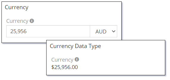
Currency
The Currency data type is used to store and display currency values. It will also include the ability to select the appropriate currency code.
The following image shows both the edit and display mode states of the Currency data type.
System Administrators can control the currency codes that are displayed in Administration | Currency.
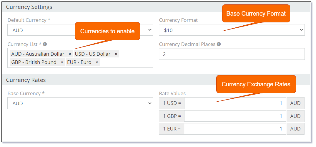
Setting the Currency Exchange Rates can be useful for entities that use currency fields that may need to be presented in an alternative currency. i.e. Products in Mythradon need to be defined with a List Price Ex Tax. If Product line items are added to Quotes and Invoices the base currency of the Quote or Invoice can be changed and the line items can be recalculated. Recalculating the Quote or Invoice line items will use the current exchange rates in Currency Settings.
The ability to set Currency Exchange Rates can prove beneficial for entities that utilise currency fields, which may require presentation in alternative currencies. For instance, in Mythradon, products need to be defined with a List Price Ex Tax. In case product line items are added to quotes and invoices, the base currency of the quote or invoice can be changed, and the line items can be recalculated. This process will employ the current exchange rates in Currency Settings for recalculating the quote or invoice line items.
On other entities that use Currency fields you can control if Currency Conversions can be applied to individual fields by setting/unsetting the Disable Conversion property.
The Currency data type supports the following properties:
| Property | Description |
|---|---|
| Name | Name of the field. |
| Label | The display label for the field. |
| Required | Controls if the field is a required field. The field will only be required if it is displayed. i.e., if you are using conditional logic that hides a 'required' field, the 'required' is ignored. |
| Default | Default value for the field. |
| Min | Minimum acceptable value validation. If empty there is no validation applied. |
| Max | Maximum acceptable value validation. If empty there is no validation applied. |
| Only Default Currency | Controls if only the default currency will be available. |
| Disable Conversion | Controls if the currency conversion action will be applied to this field. |
| Audited | Controls if changes to the field value will be audit logged in the stream. |
| Read-only | Controls if the field is read-only. |
| Is Personal Data | Controls if the data stored in the field is considered personal data. Personal data is displayed View Personal Data menu item for the record. |
| Disable Inline Edit | Controls if inline editing is enabled for the field. |
| Tooltip Text | Popup hint text that will display when you click the information icon related to a field. |
Dynamic logic can be exemplified by how one or more fields' values control the visibility, requirement, read-only status or validity of a particular field.
The Currency data type supports the following dynamic logic properties:
| Property | Description |
|---|---|
| Conditions making field visible | Dynamic logic that controls if a field is visible on the User Interface |
| Conditions making field required | Dynamic logic that controls if a field is required on the User Interface |
| Conditions making field read-only | Dynamic logic that controls if the field is read-only on the User Interface |
| Conditional options | Dynamic logic that controls the available options in the Check list. |
| Conditions making field invalid | Dynamic logic that controls the validity of the field. If the field is deemed invalid, the record cannot be saved. |
Date
The Date data type is used for the storage and display of date values. The Date data type does not support a time portion. Refer to the Date Time data type if you require time.
The following image shows the Date data type in edit mode and in view mode. This is with the property Use Numeric Format is set to 'False'.
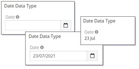
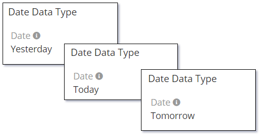
The Use Numeric Format is set to 'False' will also control how the current date, previous day and next day values are displayed.
The Date and the Date Time data types provide a popup calendar to select the required date. If no Default property value is provided then the calendar will default to the current date.
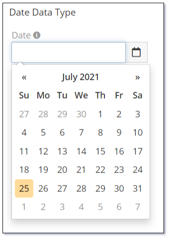
The calendar has many little features that assist with quickly being able to select a valid date.

Note: Dates are displayed according to the User's preference settings.
The Date data type supports the following properties:
| Property | Description |
|---|---|
| Name | Name of the field. |
| Label | The display label for the field. |
| Required | Controls if the field is a required field. The field will only be required if it is displayed. i.e., if you are using conditional logic that hides a 'required' field, the 'required' is ignored. |
| Default | Default value for the field. |
| After (field) | Validates that the date value should be after a date value of a specified field. |
| Before (field) | Validates that the data value should be before a date value of a specified field. |
| Use Numeric Format | Controls if the words 'today', 'yesterday', 'tomorrow' are displayed in the detail view mode. Set this to 'true' to disable this feature and simply display dates. |
| Audited | Controls if changes to the field value will be audit logged in the stream. |
| Read-only | Controls if the field is read-only. |
| After | The date value should be after the specified Today value. Possible values are:
|
| Before | The date value should be before the specified Today value. Possible values are:
|
| Disable Inline Edit | Controls if inline editing is enabled for the field. |
| Tooltip Text | Popup hint text that will display when you click the information icon related to a field. |
Dynamic logic can be exemplified by how one or more fields' values control the visibility, requirement, read-only status or validity of a particular field.
The Date data type supports the following dynamic logic properties:
| Property | Description |
|---|---|
| Conditions making field visible | Dynamic logic that controls if a field is visible on the User Interface |
| Conditions making field required | Dynamic logic that controls if a field is required on the User Interface |
| Conditions making field read-only | Dynamic logic that controls if the field is read-only on the User Interface |
| Conditions making field invalid | Dynamic logic that controls the validity of the field. If the field is deemed invalid, the record cannot be saved. |
Date Time
The Date Time data type is used for the storage of date/time values. The date/time values are stored in GMT or UTC time but are displayed according to the User's specific time zone offset based on their locale time zone setting.
The Date Time data type differs from the Date data type in its display as it has two separate fields. One for the date and a separate field for the time. The unit of measure of steps for the time can be controlled using the Minute Step property.
The following image shows the different states of the Date Time data type:
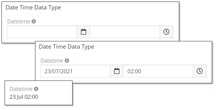
The calendar used for the Date Time data type is the same as that used for the Date data type. For information on the features of the calendar refer to the documentation on the Date data type.
The Date Time data type supports the following properties:
| Property | Description |
|---|---|
| Name | Name of the field. |
| Label | The display label for the field. |
| Required | Controls if the field is a required field. The field will only be required if it is displayed. i.e., if you are using conditional logic that hides a 'required' field, the 'required' is ignored. |
| Default | Default value for the field. Possible values:
|
| After (field) | Validates that the date value should be after a date value of a specified field. |
| Before (field) | Validates that the data value should be before a date value of a specified field. |
| Use Numeric Format | Controls if the words 'today', 'yesterday', 'tomorrow' are displayed in the detail view mode. Set this to 'true' to disable this feature and simply display dates. |
| Minute Step | Defines items displayed in the minutes picklist. Possible values:
|
| Audited | Controls if changes to the field value will be audit logged in the stream. |
| Read-only | Controls if the field is read-only. |
| After | The date value should be after the specified current date-time value. Possible values are:
|
| Before | The date value should be before the specified current date-time value. Possible values are:
|
| Disable Inline Edit | Controls if inline editing is enabled for the field. |
| Tooltip Text | Popup hint text that will display when you click the information icon related to a field. |
Dynamic logic can be exemplified by how one or more fields' values control the visibility, requirement, read-only status or validity of a particular field.
The Date Time data type supports the following dynamic logic properties:
| Property | Description |
|---|---|
| Conditions making field visible | Dynamic logic that controls if a field is visible on the User Interface |
| Conditions making field required | Dynamic logic that controls if a field is required on the User Interface |
| Conditions making field read-only | Dynamic logic that controls if the field is read-only on the User Interface |
| Conditions making field invalid | Dynamic logic that controls the validity of the field. If the field is deemed invalid, the record cannot be saved. |
Date Time with Time Zone
The Date Time with Time Zone data type is used for the storage of date/time values with the addition of selecting a time zone.
This special date/time data type will have three separate data entry fields:
- Date Field
- Time Field
- Time zone Field
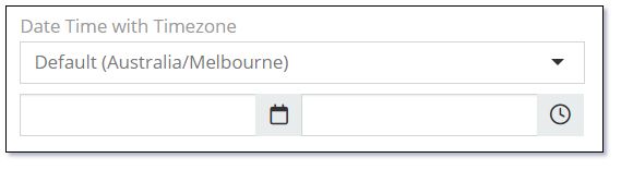
This date time data type will display two separate date/time values when in display mode. One date/time value is the User's time zone, the other is the date/time value displayed in the selected time zone.
Refer to User Preferences for setting the User's time zone

Note: In the two images displayed above the field was labelled 'Date Time with Time zone'. The following examples will use the label 'Start Time'.
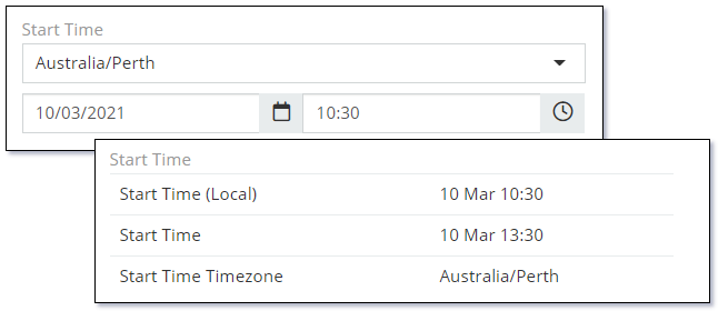
This version of the Date/Time data type is useful for booking type systems where the location of the booking could be in a different location (time zone) to other users maintaining or viewing the data.
Like the Date Time data type, the Date Time with Time Zone supports the Minute Step property so you can define the unit of measure of the time steps. i.e., 5, 10, 15 etc
The calendar used for the Date Time with Time Zone data type is the same as that used for the Date data type. For information on the features of the calendar refer to the documentation on the Date data type.
When you create a new Date Time with Time Zone field in the Entity Manager you will have three separate fields.
- Date/Time (In Selected Time zone)
- Time zone
- Local Date/Time - (In User's Time zone)
When displaying this on a Detail View you only need to add the Date/Time field. This is special multi-field data type. However this multi-field display doesn't work for List Views. You have to add the required fields to the List View separately.
Note: The 'Local' Date/Time field (Date/Time as per the User's Time zone) can not be displayed on a List View without the other two fields also being included in the List View.
This field is not available in:
- List View Filters
- Dynamic Logic
- Mass Updates
- PDF Templates
Top | Date Time with Time zone
The Date Time with Time zone data type supports the following properties:
| Property | Description |
|---|---|
| Name | Name of the field. |
| Label | The display label for the field. |
| Required | Controls if the field is a required field. The field will only be required if it is displayed. i.e., if you are using conditional logic that hides a 'required' field, the 'required' is ignored. |
| Default Timezone | Default time zone value. Possible values: Timezones |
| Default | Default value for the field. Possible values:
|
| Use Numeric Format | Controls if the words 'today', 'yesterday', 'tomorrow' are displayed in the detail view mode. Set this to 'true' to disable this feature and simply display dates. |
| Minute Step | Defines items displayed in the minutes picklist. Possible values:
|
| Audited | Controls if changes to the field value will be audit logged in the stream. |
| Read-only | Controls if the field is read-only. |
| Disable Inline Edit | Controls if inline editing is enabled for the field. |
| Tooltip Text | Popup hint text that will display when you click the information icon related to a field. |
Top | Date Time with Time zone
Dynamic logic can be exemplified by how one or more fields' values control the visibility, requirement, read-only status or validity of a particular field.
The Date Time with Time zone data type supports the following dynamic logic properties:
| Property | Description |
|---|---|
| Conditions making field visible | Dynamic logic that controls if a field is visible on the User Interface |
| Conditions making field required | Dynamic logic that controls if a field is required on the User Interface |
| Conditions making field read-only | Dynamic logic that controls if the field is read-only on the User Interface |
| Conditions making field invalid | Dynamic logic that controls the validity of the field. If the field is deemed invalid, the record cannot be saved. |
Top | Date Time with Time zone
Enum
The Enum (enumeration) data type provides a picklist of values where only one value can be selected at a time.
Enum data types store the actual value selected in the database. If you change the value of an Option in the Enum it will not update all records where the previous value was used.
The following image shows the different states of the Enum data type:
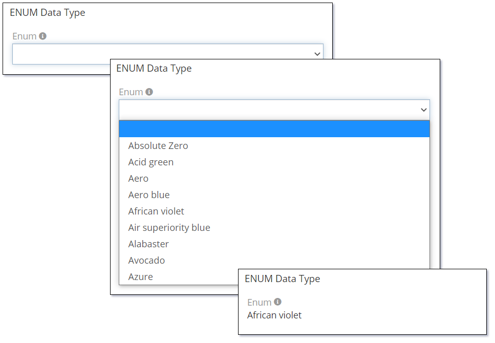
Use the Display as Label property and set the label for each item to display the Enum values as per the following image:
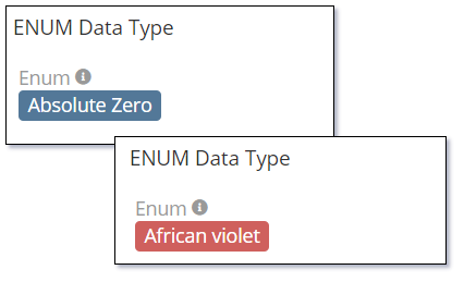
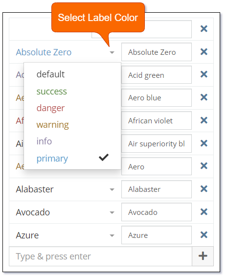
The following shows how to set the label color for each item:
Note: If you want users to be able to select an empty value in an Enum (Picklist) field; simply add a blank value to the 'Options' property as the first field.
The Enum data type supports the following properties:
| Property | Description |
|---|---|
| Name | Name of the field. |
| Label | The display label for the field. |
| Required | Controls if the field is a required field. The field will only be required if it is displayed. i.e., if you are using conditional logic that hides a 'required' field, the 'required' is ignored. |
| Options | A list of values (key => label pairs). A color style can be specified for each option. The colors are displayed as labels when the Display as Label is enabled. |
| Default | Default value for the field. |
| Is Sorted | Controls if the Options are displayed in alphabetical order. |
| Display as Label | Controls if the selected values are displayed as labels with a color. A color style can be specified for each option. Available options:
|
| Audited | Controls if changes to the field value will be audit logged in the stream. |
| Read-only | Controls if the field is read-only. |
| Disable Inline Edit | Controls if inline editing is enabled for the field. |
| Tooltip Text | Popup hint text that will display when you click the information icon related to a field. |
Dynamic logic can be exemplified by how one or more fields' values control the visibility, requirement, read-only status, specific value display, or validity of a particular field.
The Enum data type supports the following dynamic logic properties:
| Property | Description |
|---|---|
| Conditions making field visible | Dynamic logic that controls if a field is visible on the User Interface |
| Conditions making field required | Dynamic logic that controls if a field is required on the User Interface |
| Conditions making field read-only | Dynamic logic that controls if the field is read-only on the User Interface |
| Conditional options | Dynamic logic that controls the available options in the Check list. |
| Conditions making field invalid | Dynamic logic that controls the validity of the field. If the field is deemed invalid, the record cannot be saved. |
File
The File data type is used to add a single file to the form.
The following image shows the different states of the File data type:
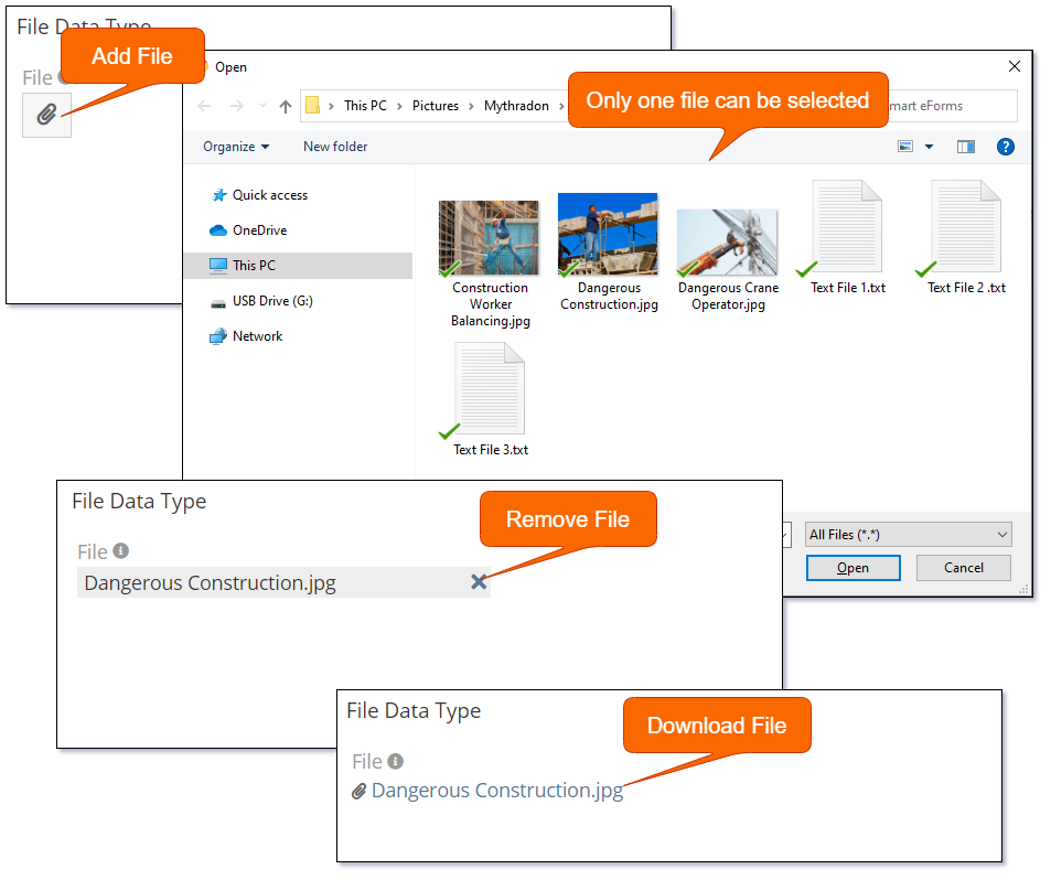
Use the Source List property to allow selection of files from internal Documents. This will display an additional button as per the following image:
To add more than one one file use the Attachment Multiple data type.
The File data type supports the following properties:
| Property | Description |
|---|---|
| Name | Name of the field. |
| Label | The display label for the field. |
| Required | Controls if the field is a required field. The field will only be required if it is displayed. i.e., if you are using conditional logic that hides a 'required' field, the 'required' is ignored. |
| Source List | Allows the user to attach a file from another record in the system. Supported Sources are:
|
| Max File Size (Mb) | Allows you to restrict the size of the file that can be attached. Size in defined in Mega Bytes (Mb). If empty there is no enforced restriction. |
| Accept | Controls the types of files that can be uploaded. Supported values are:
*.txt |
| Audited | Controls if changes to the field value will be audit logged in the stream. |
| Disable Inline Edit | Controls if inline editing is enabled for the field. |
| Tooltip Text | Popup hint text that will display when you click the information icon related to a field. |
Dynamic logic can be exemplified by how one or more fields' values control the visibility, requirement, read-only status or validity of a particular field.
The File data type supports the following dynamic logic properties:
| Property | Description |
|---|---|
| Conditions making field visible | Dynamic logic that controls if a field is visible on the User Interface |
| Conditions making field required | Dynamic logic that controls if a field is required on the User Interface |
| Conditions making field read-only | Dynamic logic that controls if the field is read-only on the User Interface |
| Conditions making field invalid | Dynamic logic that controls the validity of the field. If the field is deemed invalid, the record cannot be saved. |
Float
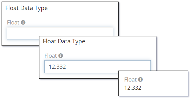
The Float data type is used to store decimal numbers.
The following image shows the different states of the Float data type:
The Float data type supports the following properties:
| Property | Description |
|---|---|
| Name | Name of the field. |
| Label | The display label for the field. |
| Required | Controls if the field is a required field. The field will only be required if it is displayed. i.e., if you are using conditional logic that hides a 'required' field, the 'required' is ignored. |
| Default | Default value for the field. |
| Min | Minimum acceptable value validation. If empty there is no validation applied. |
| Max | Maximum acceptable value validation. If empty there is no validation applied. |
| Decimal Places | Controls the number of decimal places that should be displayed when the record is in read mode. This is not applied when the record is in edit mode. |
| Audited | Controls if changes to the field value will be audit logged in the stream. |
| Read-only | Controls if the field is read-only. |
| Disable Inline Edit | Controls if inline editing is enabled for the field. |
| Tooltip Text | Popup hint text that will display when you click the information icon related to a field. |
Dynamic logic can be exemplified by how one or more fields' values control the visibility, requirement, read-only status or validity of a particular field.
The Float data type supports the following dynamic logic properties:
| Property | Description |
|---|---|
| Conditions making field visible | Dynamic logic that controls if a field is visible on the User Interface |
| Conditions making field required | Dynamic logic that controls if a field is required on the User Interface |
| Conditions making field read-only | Dynamic logic that controls if the field is read-only on the User Interface |
| Conditions making field invalid | Dynamic logic that controls the validity of the field. If the field is deemed invalid, the record cannot be saved. |
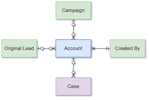
Foreign
The Foreign data type is used to include a field from a related entity. All Foreign data type fields are read-only. In order for Foreign data types to work they need the following properties defined:
- Link
- Field
The related entity must be a parent of the current entity which the Foreign data type field is being added to. This is defined by the Link property.
i.e., Using the following diagram as an example. Let's assume that we are trying to create a field of type Foreign in the Account entity. We can do so from the 'Original Lead', 'Campaign' and 'Created By' entities (or more to the point Relationships) as the Account is a child record or has a Foreign Key column in it's table definition to these entities.
However, the Account entity in an optional parent to the Case entity and therefore can not support the ability to create a field of type Foreign with the Case. In other words, there is no Foreign Key column in the Account table definition used to relate the Account to the Case. The Case has a Foreign Key column relating it as a child of the Account (A Case can be created without being related to an Account).
The following image shows the various states of a Foreign data type field. In this case we have defined the Campaign Status field on the Account entity using the Campaign link.
When the user selects a Campaign the Campaign Status is displayed.
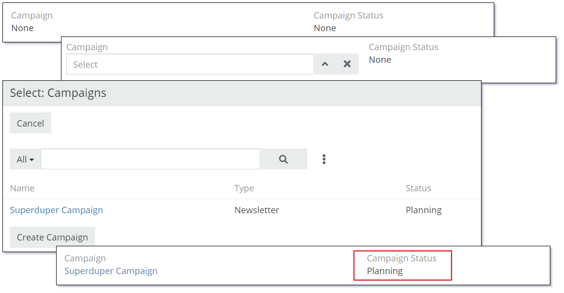
If the value of the Status field is updated on the related Campaign record the Campaign Status field on the Account will automatically reflect this value the next time the record display is refreshed. The Campaign Status is not stored or persisted in the Account table, it is always stored in the Campaign table sourced by a database JOIN when retrieving the Account record.
The Foreign data type supports the following properties:
| Property | Description |
|---|---|
| Name | Name of the field. |
| Label | The display label for the field. |
| Link | The Link where the foreign field resides. |
| Field | The Field from the above Link that is the source of this Foreign field. This field will no be editable in the current entity. |
| Tooltip Text | Popup hint text that will display when you click the information icon related to a field. |
Dynamic logic can be exemplified by how one or more fields' values control the visibility, read-only status or validity of a particular field.
The Foreign data type supports the following dynamic logic properties:
| Property | Description |
|---|---|
| Conditions making field visible | Dynamic logic that controls if a field is visible on the User Interface |
| Conditions making field read-only | Dynamic logic that controls if the field is read-only on the User Interface |
| Conditions making field invalid | Dynamic logic that controls the validity of the field. If the field is deemed invalid, the record cannot be saved. |
Header Text
The Header Text data type is used to display a header. It can be used on a page layout to separate values with a nicely formatted heading.
The following image shows an example with both Header and Sub Header text.

The following is an example of the same Header Text data type used to display a nice heading to the first section on the Account detail view:
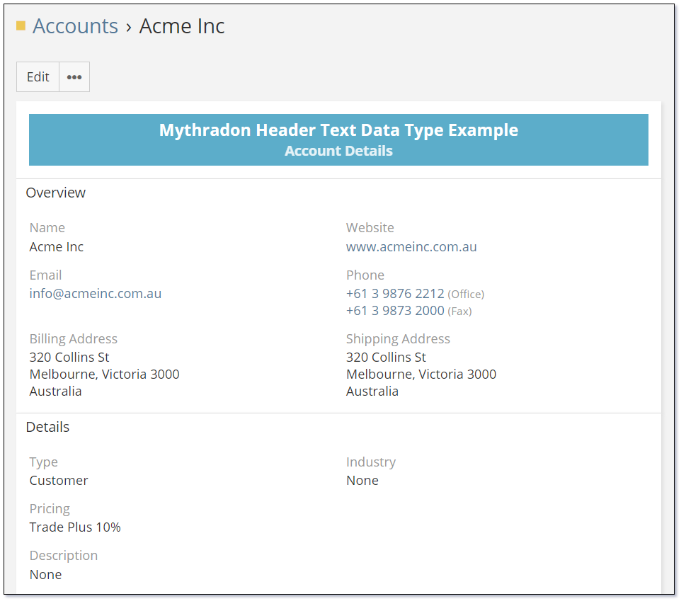
The text for both the Header and the Sub Header are centred.
The Header Text data type supports the following properties:
| Property | Description |
|---|---|
| Name | Name of the header. |
| Header Text | Text to be displayed as the header. |
| Header Size | Size of the font used to display the header text. |
| Sub Header Text | Text to be displayed as the sub header. |
| Sub Header Size | Size of the font used to display the sub header text. |
| Text Color | HTML color code for the text color. |
| Text Center Align | Controls if the text is centre aligned. |
| Background Color | HTML color code for the background color. |
The Header Text data type supports the following dynamic logic properties:
| Property | Description |
|---|---|
| Dynamic Visibility | Dynamic Logic that controls the visibility of the fields. |
Image
The Image data type is used to store and display images. The images can be displayed in a variety of sizes.
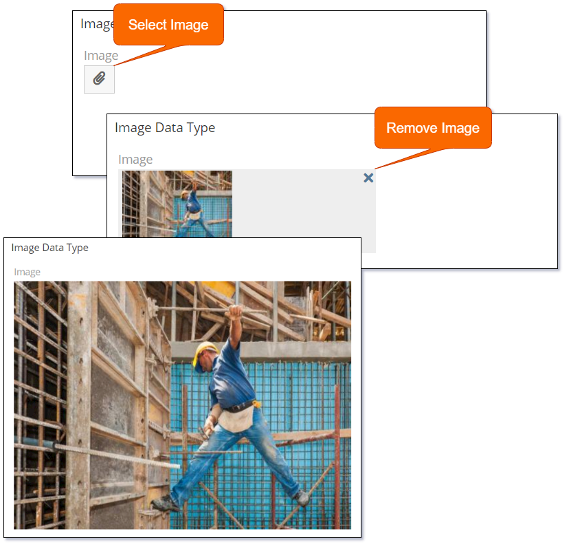
The Image data types is used to add a single image. If you require more than a single image check the Attachment Multiple data type.
The Image data type supports the following properties:
| Property | Description |
|---|---|
| Name | Name of the field. |
| Label | The display label for the field. |
| Required | Controls if the field is a required field. The field will only be required if it is displayed. i.e., if you are using conditional logic that hides a 'required' field, the 'required' is ignored. |
| Preview Size | Controls the size of the images displayed in the preview. Valid options are:
|
| Preview Size in List View | Controls the size of the images displayed in the list preview. Valid options are:
|
| Max File Size (Mb) | Controls the maximum file size that can be uploaded. |
| Audited | Controls if changes to the field value will be audit logged in the stream. |
| Disable Inline Edit | Controls if inline editing is enabled for the field. |
| Tooltip Text | Popup hint text that will display when you click the information icon related to a field. |
Dynamic logic can be exemplified by how one or more fields' values control the visibility, requirement, read-only status or validity of a particular field.
The Image data type supports the following dynamic logic properties:
| Property | Description |
|---|---|
| Conditions making field visible | Dynamic logic that controls if a field is visible on the User Interface |
| Conditions making field required | Dynamic logic that controls if a field is required on the User Interface |
| Conditions making field read-only | Dynamic logic that controls if the field is read-only on the User Interface |
| Conditions making field invalid | Dynamic logic that controls the validity of the field. If the field is deemed invalid, the record cannot be saved. |
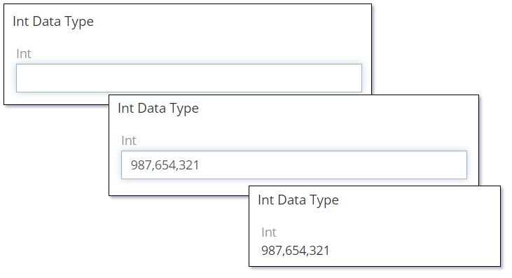
Integer
The Integer data type is used to store and display whole numbers.
The following image shows the different states of the Int data type:
The Integer data type supports the following properties:
| Property | Description |
|---|---|
| Name | Name of the field. |
| Label | The display label for the field. |
| Required | Controls if the field is a required field. The field will only be required if it is displayed. i.e., if you are using conditional logic that hides a 'required' field, the 'required' is ignored. |
| Default | Default value for the field. |
| Min | Minimum acceptable value validation. If empty there is no validation applied. |
| Max | Maximum acceptable value validation. If empty there is no validation applied. |
| Disable Formatting | Controls if the value should be displayed with a thousand separators. i.e., 20,000 versus 20000 |
| Audited | Controls if changes to the field value will be audit logged in the stream. |
| Read-only | Controls if the field is read-only. |
| Disable Inline Edit | Controls if inline editing is enabled for the field. |
| Tooltip Text | Popup hint text that will display when you click the information icon related to a field. |
Dynamic logic can be exemplified by how one or more fields' values control the visibility, requirement, read-only status or validity of a particular field.
The Integer data type supports the following dynamic logic properties:
| Property | Description |
|---|---|
| Conditions making field visible | Dynamic logic that controls if a field is visible on the User Interface |
| Conditions making field required | Dynamic logic that controls if a field is required on the User Interface |
| Conditions making field read-only | Dynamic logic that controls if the field is read-only on the User Interface |
| Conditions making field invalid | Dynamic logic that controls the validity of the field. If the field is deemed invalid, the record cannot be saved. |
Map Route
The Map Route data type is used to display one or more addresses on a Google Map display with travel routing shown between the addresses.
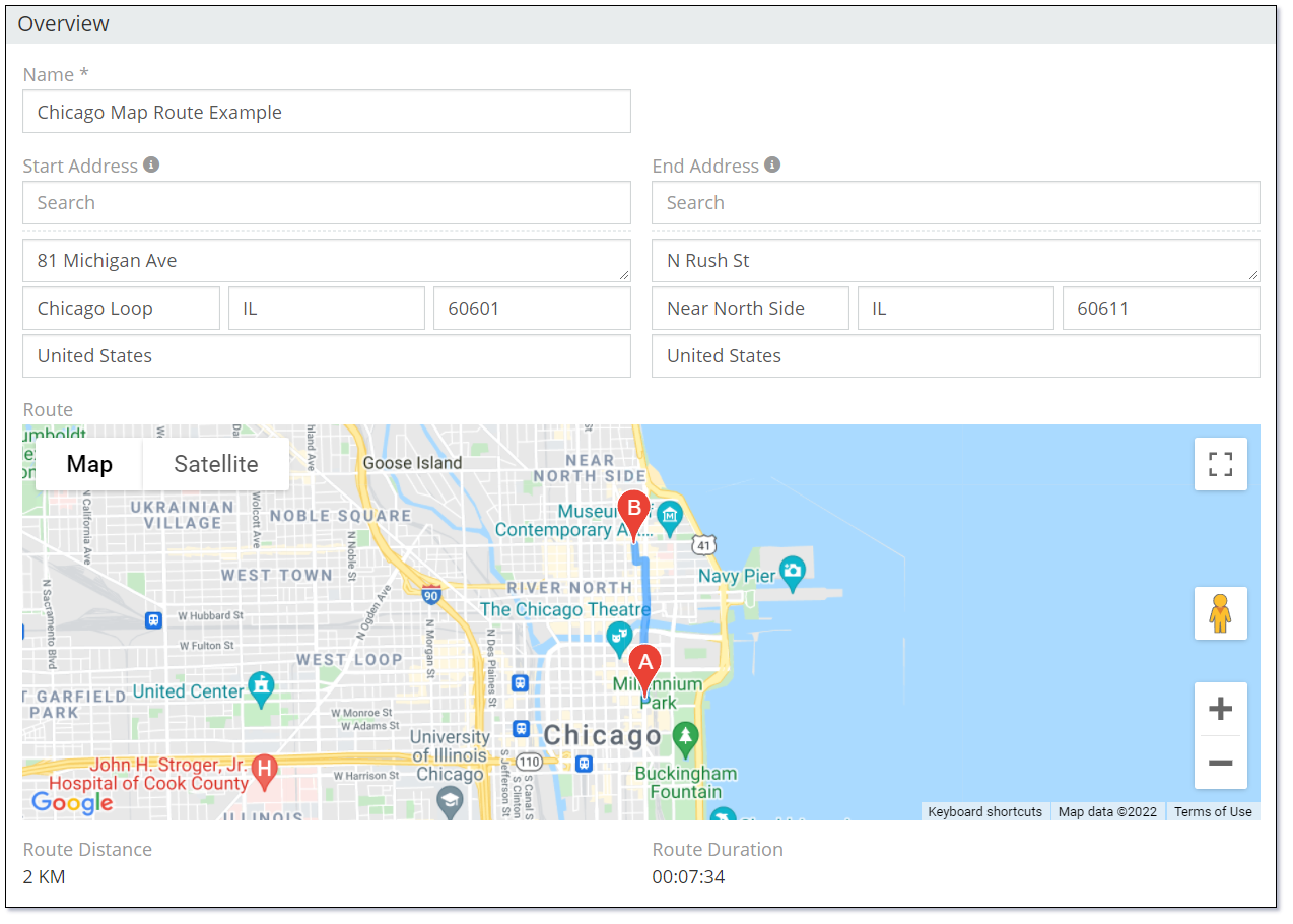
The addresses that are displayed are other address fields on the same record. In order to use this, you must have at least one other Address data type field defined in the entity.
The address field values are linked in the order of the address fields defined in the Points property of the Map Route field shown in the following image.
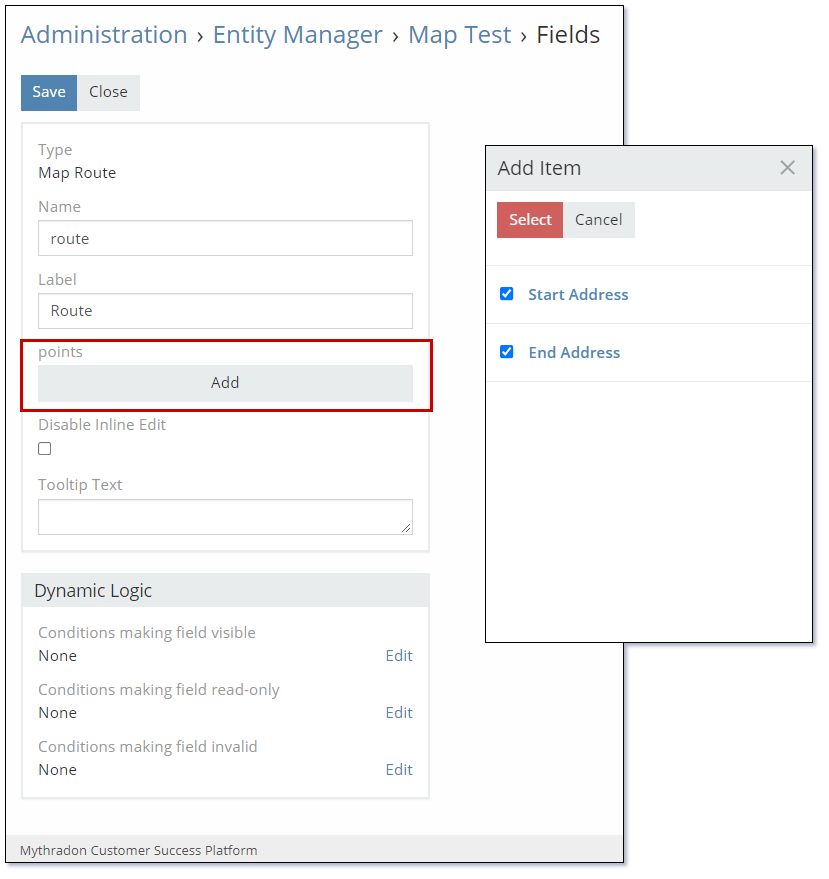
The Map Route data type supports the following properties:
| Property | Description |
|---|---|
| Name | Name of the field. |
| Label | The display label for the field. |
| Points | List of Address fields that act as map points to render the routes. The route pins are printed on the map according to the order of the pins. |
| Disable Inline Edit | Controls if inline editing is enabled for the field. |
| Tooltip Text | Popup hint text that will display when you click the information icon related to a field. |
Dynamic logic can be exemplified by how one or more fields' values control the visibility, read-only status or validity of a particular field.
The Map Route data type supports the following dynamic logic properties:
| Property | Description |
|---|---|
| Conditions making field visible | Dynamic logic that controls if a field is visible on the User Interface |
| Conditions making field required | Dynamic logic that controls if a field is required on the User Interface |
| Conditions making field read-only | Dynamic logic that controls if the field is read-only on the User Interface |
| Conditions making field invalid | Dynamic logic that controls the validity of the field. If the field is deemed invalid, the record cannot be saved. |
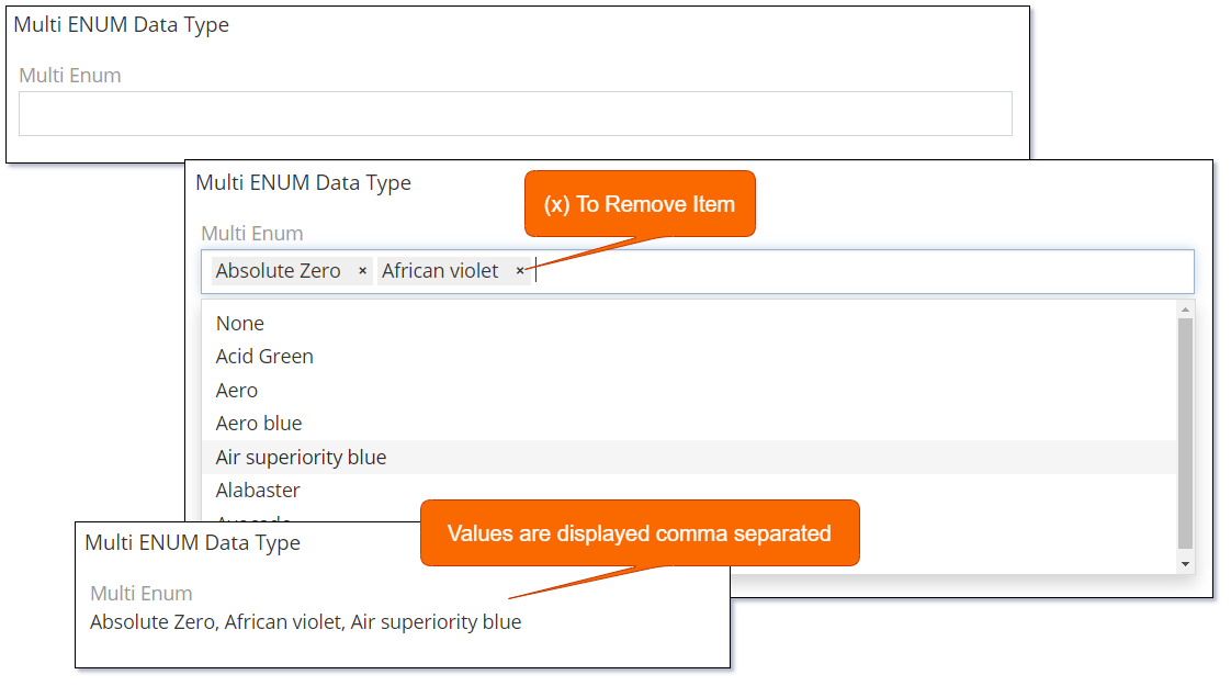
Multi-Enum
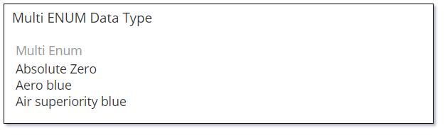
The Multi-Enum (multi enumeration) is used to display a list of multiple values that can be selected from a picklist.
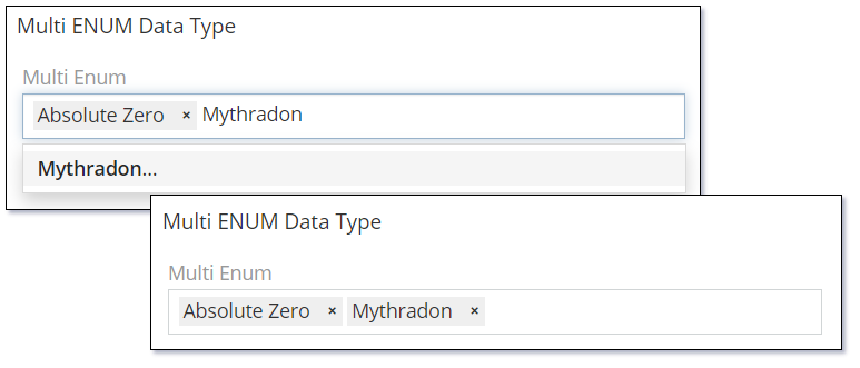
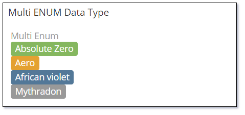
The following image shows the different states of the Multi-Enum data type:
Setting the Display As List property to 'True' will display the selected items in the following format:
Setting the Allow Custom Options property to 'True' allows the user to type in a value that is not in the list. In this example the word 'Mythradon' is being typed in by the user.
Use the Display as Label property and set the label for each item to display the Multi-Enum values as per the following image:
The Multi-Enum data type supports the following properties:
| Property | Description |
|---|---|
| Name | Name of the field. |
| Label | The display label for the field. |
| Required | Controls if the field is a required field. The field will only be required if it is displayed. i.e., if you are using conditional logic that hides a 'required' field, the 'required' is ignored. |
| Options | A list of values (key => label pairs). A color style can be specified for each option. The colors are displayed as labels when the Display as Label is enabled. |
| Is Sorted | Controls if the Options are displayed in alphabetical order. |
| Allow Custom Options | Controls if the user can enter a custom option that is not part of the coded options. |
| Max Item Count | Controls the maximum number of items that can be selected. |
| Display as Label | Controls if the selected values are displayed as labels with a color. A color style can be specified for each option. Available options:
|
| Display As List | Controls if the items will be displayed as a list with each item on a new line. |
| Pattern | A regular expression to check a field value against. Refer to Validation Patterns for further details. |
| Audited | Controls if changes to the field value will be audit logged in the stream. |
| Read-only | Controls if the field is read-only. |
| Disable Inline Edit | Controls if inline editing is enabled for the field. |
| Tooltip Text | Popup hint text that will display when you click the information icon related to a field. |
Dynamic logic can be exemplified by how one or more fields' values control the visibility, requirement, read-only status, specific value display, or validity of a particular field.
The Multi-Enum data type supports the following dynamic logic properties:
| Property | Description |
|---|---|
| Conditions making field visible | Dynamic logic that controls if a field is visible on the User Interface |
| Conditions making field required | Dynamic logic that controls if a field is required on the User Interface |
| Conditions making field read-only | Dynamic logic that controls if the field is read-only on the User Interface |
| Conditional options | Dynamic logic that controls the available options in the Check list. |
| Conditions making field invalid | Dynamic logic that controls the validity of the field. If the field is deemed invalid, the record cannot be saved. |
Number
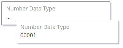
The Number data type provides an auto-incrementing number that is of type string. Supports applying a prefix and setting a specific length.
An auto-incrementing number of string type with a possible prefix and specific length.
The Number data type supports the following properties:
| Property | Description |
|---|---|
| Name | Name of the field. |
| Label | The display label for the field. |
| Prefix | A text value that will be applicated to next auto-incremented record. |
| Next Number | A number that will be applied to the next created record. |
| Pad Length | A padded length of the numeric part. If the length of the integer value is shorter than this length the value will be padded with zero digits. i.e., '00001'. |
| Disable Inline Edit | Controls if inline editing is enabled for the field. |
| Tooltip Text | Popup hint text that will display when you click the information icon related to a field. |
The Number data type supports the following dynamic logic properties:
| Property | Description |
|---|---|
| Conditions making field visible | Dynamic logic that controls if a field is visible on the User Interface |
Rich Text Label
The Rich Text Label data type is used to display a label that supports HTML formatting such as font type, size and color.

The Rich Text Label uses the Mythradon Rich Text HTML editor. This editor has both a simple to use rich text editor and a switch to use HTML tags for more advanced users.
The Rich Text Label data type supports the following properties:
| Property | Description |
|---|---|
| Name | Name of the field. |
| Text | The Rich Text (HTML) that you want to use as a Label. |
The Rich Text Label data type supports the following dynamic logic properties:
| Property | Description |
|---|---|
| Conditions making field visible | Dynamic logic that controls if a field is visible on the User Interface |
Signature Pad
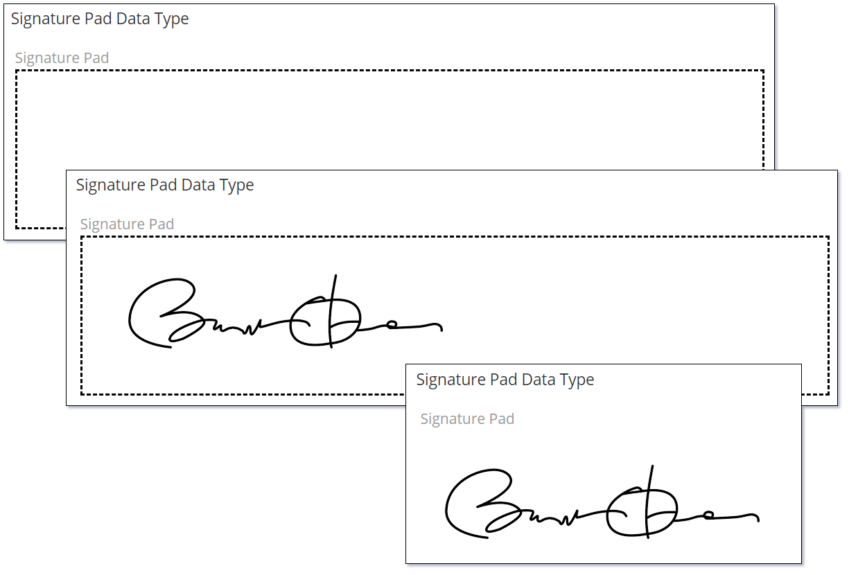
The Signature Pad data type is used to store and display signatures. Use this data type when you require a signature to authorize the completion or approval for a specific form.
The following image shows the different states of the Signature Pad data type:
The Signature data type supports the following properties:
| Property | Description |
|---|---|
| Name | Name of the field. |
| Label | The display label for the field. |
| Disable Inline Edit | Controls if inline editing of the field is enabled. |
| Tooltip Text | Popup hint text that will display when you click the information icon related to a field. |
Dynamic logic can be exemplified by how one or more fields' values control the visibility, read-only status or validity of a particular field.
The Signature Pad data type supports the following dynamic logic properties:
| Property | Description |
|---|---|
| Conditions making field visible | Dynamic logic that controls if a field is visible on the User Interface |
| Conditions making field read-only | Dynamic logic that controls if the field is read-only on the User Interface |
| Conditions making field invalid | Dynamic logic that controls the validity of the field. If the field is deemed invalid, the record cannot be saved. |
Text
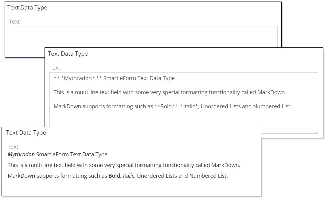
The Text data type is used to store multiline text with markdown support.
The following image shows the different states of the Text data type:
Markdown Syntax is the same formatting syntax that is used my many online wiki tools such as Wikipedia. Mythradon Text fields support only a very small subset of the full Markdown syntax.
| Syntax | Description and Example |
|---|---|
| ** Bold Text ** | ** On both ends of some text will Bold the text. i.e., **Bold This Text** Results in: Bold This Text |
| * Italic Text * | * On both ends of some text will Italic the text. i.e., *Italic This Text* Results in: Italic This Text |
| ** * Bold and Italic Text * ** | ** * On both ends of some text will Bold and Italic the text. i.e., ** *Bold and Italic This Text* ** Results in: ** Bold and Italic This Text ** |
| * Unordered List | A single * followed by text will create an unordered list item. i.e., * One * Two Results in:
|
The Text data type supports the following properties:
| Property | Description |
|---|---|
| Name | Name of the field. |
| Label | The display label for the field. |
| Required | Controls if the field is a required field. The field will only be required if it is displayed. i.e., if you are using conditional logic that hides a 'required' field, the 'required' is ignored. |
| Default | Default value for the field. |
| Max Length | Maximum length of the text that can be entered into the field. If left empty, there is not limit. |
| Disable Text Cut | Controls if long text is cut. Check this on to prevent long text being shortened. |
| Number of rows of textarea | Integer value that controls the number of rows of text that are displayed. |
| Cut Height (px) | Height in pixels that the text control will be displayed. |
| Display Raw Text (no markdown) | Controls if the text is displayed in a Raw unformatted format. This disables markdown syntax formatting the field when displayed. |
| Read-only | Controls if the field is read-only. |
| Audited | Controls if changes to the field value will be audit logged in the stream. |
| Disable Inline Edit | Controls if inline editing is enabled for the field. |
| Tooltip Text | Popup hint text that will display when you click the information icon related to a field. |
Dynamic logic can be exemplified by how one or more fields' values control the visibility, requirement, read-only status or validity of a particular field.
The Text data type supports the following dynamic logic properties:
| Property | Description |
|---|---|
| Conditions making field visible | Dynamic logic that controls if a field is visible on the User Interface |
| Conditions making field required | Dynamic logic that controls if a field is required on the User Interface |
| Conditions making field read-only | Dynamic logic that controls if the field is read-only on the User Interface |
| Conditions making field invalid | Dynamic logic that controls the validity of the field. If the field is deemed invalid, the record cannot be saved. |
URL
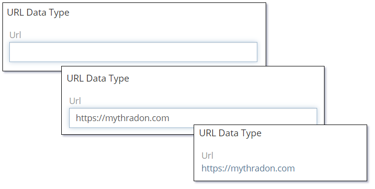
The Url data type is used to store and display links to web pages.
The following image shows the different states of the URL data type:
The URL data type supports the following properties:
| Property | Description |
|---|---|
| Name | Name of the field. |
| Label | The display label for the field. |
| Required | Controls if the field is a required field. The field will only be required if it is displayed. i.e., if you are using conditional logic that hides a 'required' field, the 'required' is ignored. |
| Default | Default value for the field. |
| Max Length | Maximum length of the text that can be entered into the field. If left empty, there is not limit. |
| Strip | Controls if trailing '/' will be stripped if the URL value starts with 'http://' or 'https://'. |
| Audited | Controls if changes to the field value will be audit logged in the stream. |
| Read-only | Controls if the field is read-only. |
| Disable Inline Edit | Controls if inline editing is enabled for the field. |
| Tooltip Text | Popup hint text that will display when you click the information icon related to a field. |
Dynamic logic can be exemplified by how one or more fields' values control the visibility, requirement, read-only status or validity of a particular field.
The URL data type supports the following dynamic logic properties:
| Property | Description |
|---|---|
| Conditions making field visible | Dynamic logic that controls if a field is visible on the User Interface |
| Conditions making field required | Dynamic logic that controls if a field is required on the User Interface |
| Conditions making field read-only | Dynamic logic that controls if the field is read-only on the User Interface |
| Conditions making field invalid | Dynamic logic that controls the validity of the field. If the field is deemed invalid, the record cannot be saved. |
Varchar
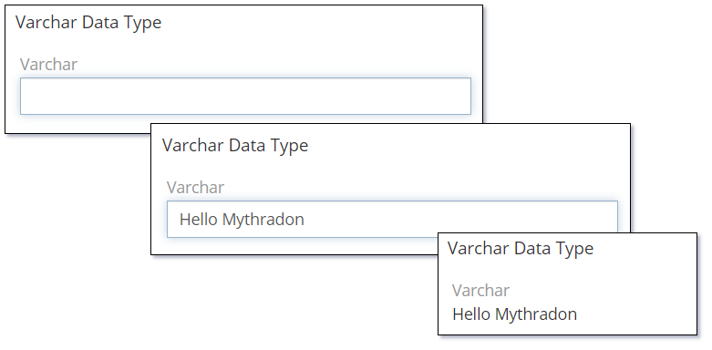
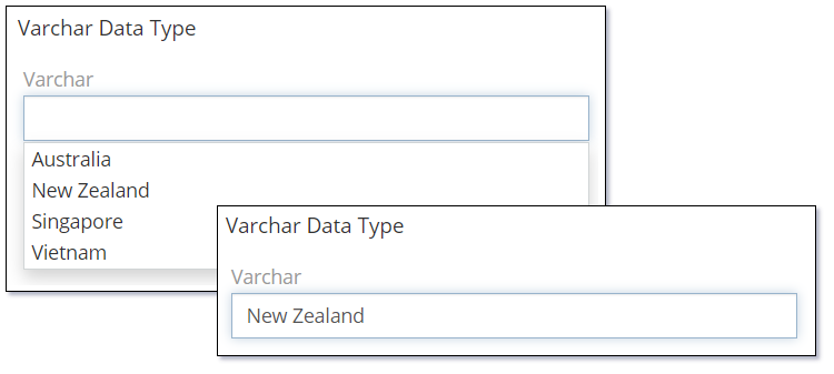
The Varchar data type is used to store and display a single-line text.
The following image shows the different states of the Varchar data type:
The following image shows the Varchar data type setup with several country names defined in the Options property. The user can select one or these or simply type in their own value.
The Varchar data type supports the following properties:
| Property | Description |
|---|---|
| Name | Name of the field. |
| Label | The display label for the field. |
| Required | Controls if the field is a required field. The field will only be required if it is displayed. i.e., if you are using conditional logic that hides a 'required' field, the 'required' is ignored. |
| Default | Default value for the field. |
| Max Length | Maximum length of the text that can be entered into the field. If left empty, there is not limit. |
| Options | A list of values (key => label pairs) that can be selected for the field value. Users can either select a value or enter their own value in a Varchar field. |
| Pattern | A regular expression to check a field value against. Refer to Validation Patterns for further details. |
| Audited | Controls if changes to the field value will be audit logged in the stream. |
| Read-only | Controls if the field is read-only. |
| Disable Inline Edit | Controls if inline editing is enabled for the field. |
| Tooltip Text | Popup hint text that will display when you click the information icon related to a field. |
Dynamic logic can be exemplified by how one or more fields' values control the visibility, requirement, read-only status or validity of a particular field.
The Varchar data type supports the following dynamic logic properties:
| Property | Description |
|---|---|
| Conditions making field visible | Dynamic logic that controls if a field is visible on the User Interface |
| Conditions making field required | Dynamic logic that controls if a field is required on the User Interface |
| Conditions making field read-only | Dynamic logic that controls if the field is read-only on the User Interface |
| Conditional options | Dynamic logic that controls the available options in the Check list. |
| Conditions making field invalid | Dynamic logic that controls the validity of the field. If the field is deemed invalid, the record cannot be saved. |
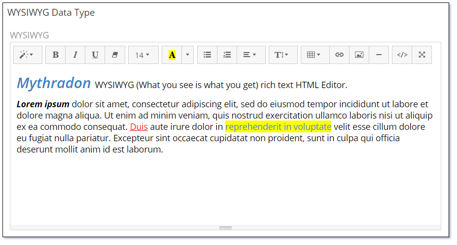
WYSIWYG
The WYSIWYG (What you see is what you get) data type provides the user with a rich text multi line data entry field.
The Rich Text editor provides a toolbar for quick selection of different font sizes, styles, colors, creation of tables and insertion of images.
The WYSIWYG data type supports the following properties:
| Property | Description |
|---|---|
| Name | Name of the field. |
| Label | The display label for the field. |
| Required | Controls if the field is a required field. The field will only be required if it is displayed. i.e., if you are using conditional logic that hides a 'required' field, the 'required' is ignored. |
| Default | Default value for the field. |
| Height (px) | Height in pixels that the text control will be displayed. |
| Min Height (px) | Minimum Height in pixels that the text control can be sized to. |
| Read-only | Controls if the field is read-only. |
| User iFrame | Controls if the WYSIWYG editor is rendered in a separate HTML iFrame. |
| Max Length | Controls the maximum acceptable length of text. |
| Disable Inline Edit | Controls if inline editing is enabled for the field. |
| Tooltip Text | Popup hint text that will display when you click the information icon related to a field. |
Dynamic logic can be exemplified by how one or more fields' values control the visibility, requirement, read-only status or validity of a particular field.
The WYSIWYG data type supports the following dynamic logic properties:
| Property | Description |
|---|---|
| Conditions making field visible | Dynamic logic that controls if a field is visible on the User Interface |
| Conditions making field required | Dynamic logic that controls if a field is required on the User Interface |
| Conditions making field read-only | Dynamic logic that controls if the field is read-only on the User Interface |
| Conditions making field invalid | Dynamic logic that controls the validity of the field. If the field is deemed invalid, the record cannot be saved. |
Special Data Types
Email
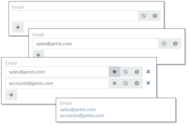
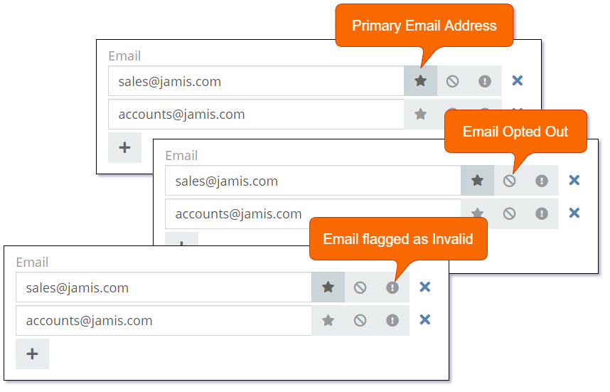
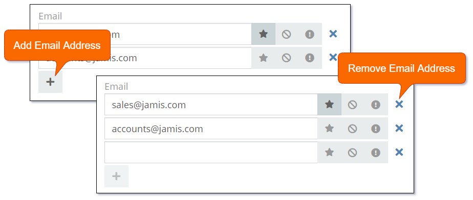
The Email data type is designed specifically for storing email addresses. The data type supports storing a set of separate email addresses each with the following properties:
- Primary - One Email address in the set can be flagged as Primary. The Primary email is the email address displayed on list views where only a single email address is displayed per record.
- Opted-Out - Allows you to opt-out the email address from being included in marketing campaigns.
- Invalid Email Address - Allows you to flag the email address as invalid without deleting the value.
There are examples of the Email data type used on the standard Account and Contact entities.
The following image shows the various states of the Email data type.
The following image shows the various properties of the Email data type.
Adding and removing email addresses.
Note: You will need to contact Mythradon support to add an 'Email' data type field.
The Email data type supports the following properties:
| Property | Description |
|---|---|
| Name | Name of the field. |
| Label | The display label for the field. |
| Required | Controls if the field is a required field. The field will only be required if it is displayed. i.e., if you are using conditional logic that hides a 'required' field, the 'required' is ignored. |
| Audited | Controls if changes to the field value will be audit logged in the stream. |
| Is Personal Data | Controls if the data stored in the field is considered personal data. Personal data is displayed View Personal Data menu item for the record. |
| Disable Inline Edit | Controls if inline editing is enabled for the field. |
| Tooltip Text | Popup hint text that will display when you click the information icon related to a field. |
Dynamic logic can be exemplified by how one or more fields' values control the visibility, requirement, read-only status or validity of a particular field.
The Email data type supports the following dynamic logic properties:
| Property | Description |
|---|---|
| Conditions making field visible | Dynamic logic that controls if a field is visible on the User Interface |
| Conditions making field required | Dynamic logic that controls if a field is required on the User Interface |
| Conditions making field read-only | Dynamic logic that controls if the field is read-only on the User Interface |
| Conditions making field invalid | Dynamic logic that controls the validity of the field. If the field is deemed invalid, the record cannot be saved. |
Link
The Link data type allows you to relate a record through a Belongs-To (many-to-one or one-to-one) relationship.
Fields with the Link data type show in the list of fields associated to an entity. However they are not created in the same way as other fields.
Link data types are actually created by defining Relationships on an entity. Once the Relationship has been created; a field of type Link will be available in the list of fields as shown in the following image.
The following image shows the various states of a Link data type field:
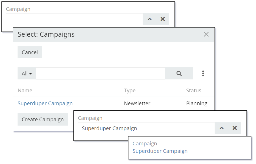
The Link data type supports the following properties:
| Property | Description |
|---|---|
| Name | Name of the field. |
| Label | The display label for the field. |
| Required | Controls if the field is a required field. The field will only be required if it is displayed. i.e., if you are using conditional logic that hides a 'required' field, the 'required' is ignored. |
| Audited | Controls if changes to the field value will be audit logged in the stream. |
| Read-only | Controls if the field is read-only. |
| Default | Default value for the field. |
| Disable Inline Edit | Controls if inline editing is enabled for the field. |
| Tooltip Text | Popup hint text that will display when you click the information icon related to a field. |
Dynamic logic can be exemplified by how one or more fields' values control the visibility, requirement, read-only status or validity of a particular field.
The Link data type supports the following dynamic logic properties:
| Property | Description |
|---|---|
| Conditions making field visible | Dynamic logic that controls if a field is visible on the User Interface |
| Conditions making field required | Dynamic logic that controls if a field is required on the User Interface |
| Conditions making field read-only | Dynamic logic that controls if the field is read-only on the User Interface |
| Conditions making field invalid | Dynamic logic that controls the validity of the field. If the field is deemed invalid, the record cannot be saved. |
Link Multiple
The Link Multiple data type allows you to relate a set of multiple records to the current record. The Link Multiple data type relates records through Has-Many (many-to-many or one-to-many) relationships.
These Relationships must be defined with the Link Multiple Field property enabled as shown in the following image:
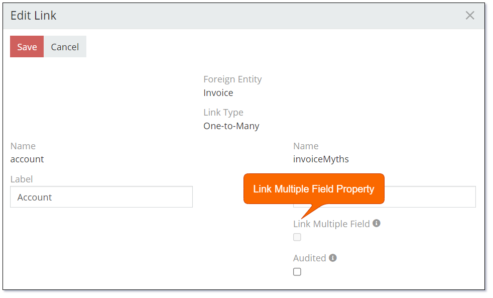
Note: It is not recommended to use the 'Link Multiple' data type if you have a large number of related records. The alternative is to use a list of related records.
A set of records related through Has-Many (many-to-many or one-to-many) relationship. Not all relationships have their link-multiple fields. Only those do, where Link-Multiple parameter(s) is enabled.
The Link Multiple data type allows you to relate a set of multiple records to the current record. The Link Multiple data type relates records through Has-Many (many-to-many or one-to-many) relationship.
These Relationships
Fields with the Link data type show in the list of fields associated to an entity. However they are not created in the same way as other fields.
Link data types are actually created by defining Relationships on an entity. Once the Relationship has been created; a field of type Link will be available in the list of fields as shown in the following image.
The following image shows the various states of a Link data type field:
The Link Multiple data type supports the following properties:
| Property | Description |
|---|---|
| Name | Name of the field. |
| Label | The display label for the field. |
| Required | Controls if the field is a required field. The field will only be required if it is displayed. i.e., if you are using conditional logic that hides a 'required' field, the 'required' is ignored. |
| Default Type | Default phone number type. |
| Audited | Controls if changes to the field value will be audit logged in the stream. |
| Is Personal Data | Controls if the data stored in the field is considered personal data. Personal data is displayed View Personal Data menu item for the record. |
| Disable Inline Edit | Controls if inline editing is enabled for the field. |
| Tooltip Text | Popup hint text that will display when you click the information icon related to a field. |
Link Parent
A record related through Belongs-To-Parent relationship. Can be of different entity types.
Parameters:
- Entity List – a list of entity types available to be related through the field.
The Link Parent data type supports the following properties:
| Property | Description |
|---|---|
| Name | Name of the field. |
| Label | The display label for the field. |
| Required | Controls if the field is a required field. The field will only be required if it is displayed. i.e., if you are using conditional logic that hides a 'required' field, the 'required' is ignored. |
| Default Type | Default phone number type. |
| Audited | Controls if changes to the field value will be audit logged in the stream. |
| Disable Inline Edit | Controls if inline editing is enabled for the field. |
| Tooltip Text | Popup hint text that will display when you click the information icon related to a field. |
Dynamic logic can be exemplified by how one or more fields' values control the visibility, requirement, read-only status or validity of a particular field.
The Link Parent data type supports the following dynamic logic properties:
| Property | Description |
|---|---|
| Conditions making field visible | Dynamic logic that controls if a field is visible on the User Interface |
| Conditions making field required | Dynamic logic that controls if a field is required on the User Interface |
| Conditions making field read-only | Dynamic logic that controls if the field is read-only on the User Interface |
| Conditions making field invalid | Dynamic logic that controls the validity of the field. If the field is deemed invalid, the record cannot be saved. |
Phone
The Phone data type is designed specifically for storing phone numbers. The data type supports storing a set of separate phone numbers each with the following properties:
- Type - Type of phone number. i.e., Home, Office, Fax. Additional phone types can be defined.
- Primary - One phone number in the set can be flagged as Primary. The Primary phone number is the number displayed on list views where only a single phone number is displayed per record.
- Opted-Out - Allows you to opt-out the phone number from being included in marketing campaigns.
- Invalid Phone Number - Allows you to flag the phone number as invalid without deleting the value.
The following image shows the various states of the Phone data type.
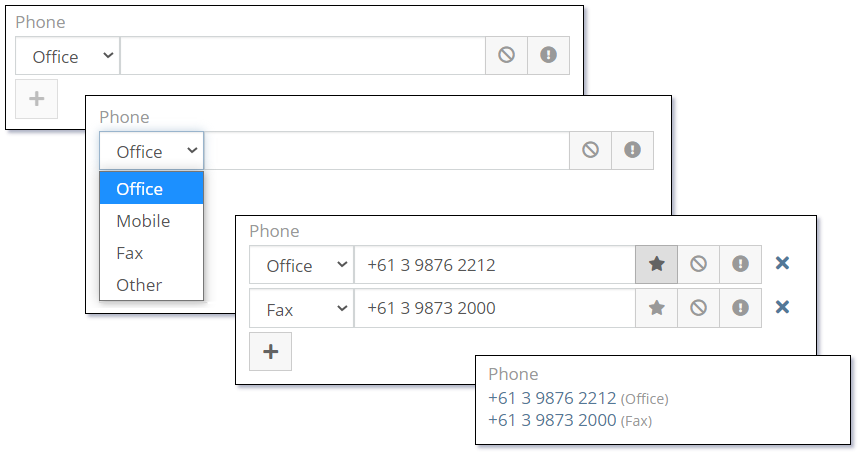
The following image shows the various properties of the Phone data type.
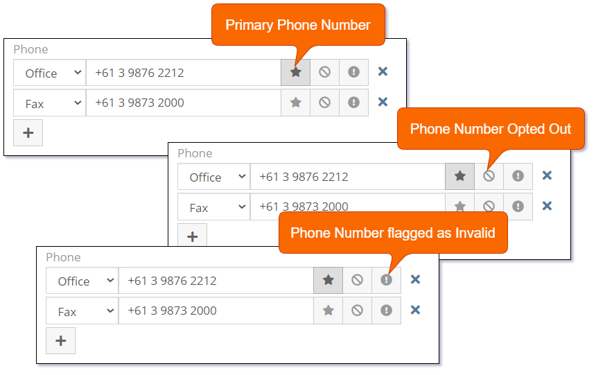
Adding and removing phone numbers.
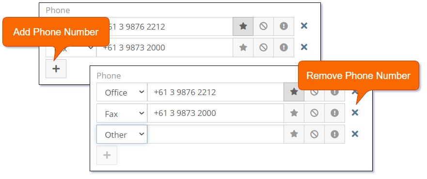
The following image shows how to add new phone types:
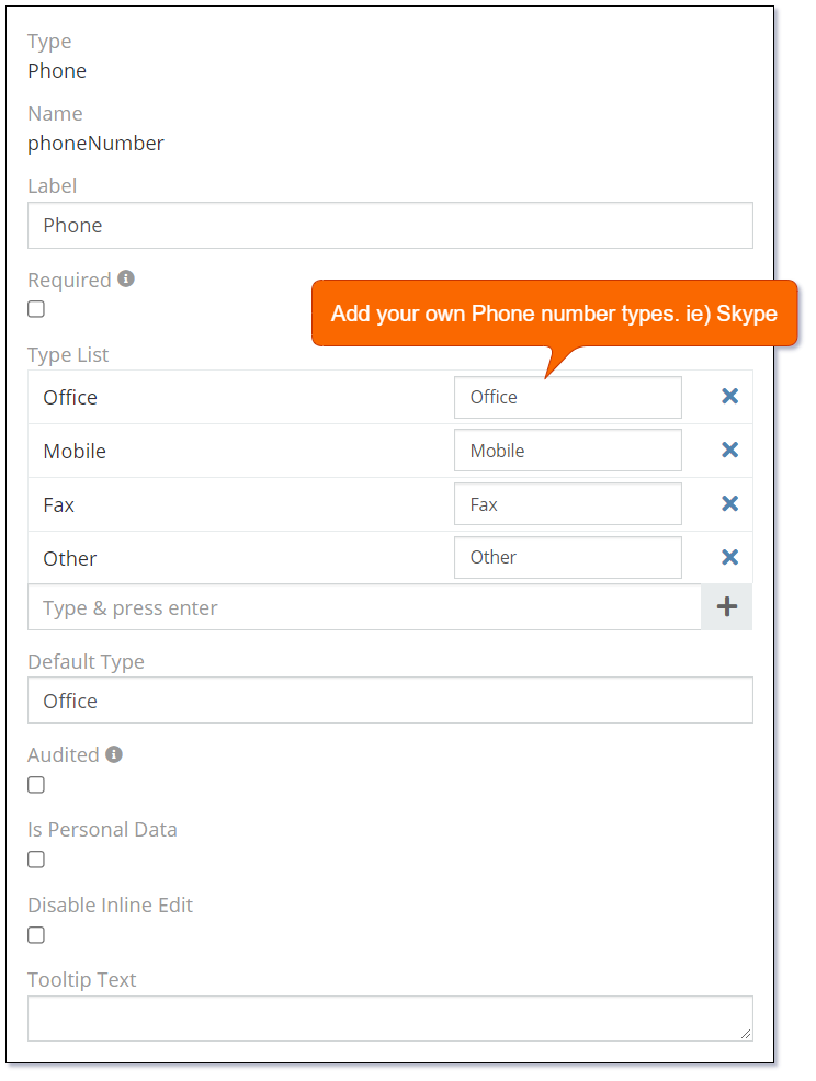
Note: You will need to contact Mythradon support to add a 'Phone' data type field.
The Phone data type supports the following properties:
| Property | Description |
|---|---|
| Name | Name of the field. |
| Label | The display label for the field. |
| Required | Controls if the field is a required field. The field will only be required if it is displayed. i.e., if you are using conditional logic that hides a 'required' field, the 'required' is ignored. |
| Default Type | Default phone number type. Possible values:
|
| Audited | Controls if changes to the field value will be audit logged in the stream. |
| Disable Inline Edit | Controls if inline editing is enabled for the field. |
| Tooltip Text | Popup hint text that will display when you click the information icon related to a field. |
Dynamic logic can be exemplified by how one or more fields' values control the visibility, requirement, read-only status or validity of a particular field.
The Phone data type supports the following dynamic logic properties:
| Property | Description |
|---|---|
| Conditions making field visible | Dynamic logic that controls if a field is visible on the User Interface |
| Conditions making field required | Dynamic logic that controls if a field is required on the User Interface |
| Conditions making field read-only | Dynamic logic that controls if the field is read-only on the User Interface |
| Conditions making field invalid | Dynamic logic that controls the validity of the field. If the field is deemed invalid, the record cannot be saved. |
Risk Matrix
A risk matrix (sometimes called a risk control matrix) is a tool used during the risk assessment stage of many business processes. It identifies and captures the likelihood of a risk and evaluates the potential damage or interruption caused by that risk.
The Mythradon Risk Matrix field offers a visual representation of the risk analysis and categorizes risks based on their level of probability and severity/impact. This field is a simple, effective way to get a view of the risk.
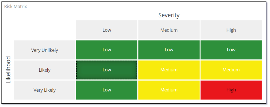
In the screenshot example, you see risk severity ranging from low to high and likelihood ranging from very likely to very unlikely. Using it is simple, find where both of your criteria meet to get your risk rating.
The Risk Matrix data type supports the following properties:
| Property | Description |
|---|---|
| Name | Name of the field. |
| Label | The display label for the field. |
| Required | Controls if the field is a required field. The field will only be required if it is displayed. i.e., if the field is on a page that the user doesn't need to complete because of the logic of the Smart eForm then the field is not required. |
| Size | Size of the matrix, it can be 3x3 or 5x5 |
| X Axis Header | Header of x-axis of the matrix. By default, it is Severity which is the level of the risk's impact. |
| Y Axis Header | Head of y-axis of the matrix. By default, it is Likelihood which is the possibility that the risk will happen. |
| X Axis Description | An user friendly description of the x-axis. |
| Y Axis Description | An user friendly description of the y-axis. |
| X Axis Rating | The value of rating to be shown on the x-axis. You can use number or text value. I.e.) Low, Medium, High. |
| Y Axis Rating | The value of rating to be shown on the y-axis. You can use number or text value. I.e.) Low, Medium, High. |
| Has Custom Cells Rating Titles | Whether the cell has a different rating title from the default. If checked, you can enter new custom titles. |
| Has Custom Cells Colors | Whether the cell has a different color from the default - which is RAG (Red-Amber-Green). If checked, you can select the new custom colors. |
| Show Cells Values | Whether the value of the cell is shown as a text. Value of the cell is the minimum value of the x-axis and the y-axis. I.e.) If the x-axis value is Medium and the y-axis value is Low, the cell value will be Low. |
| Tooltip Text | Popup hint text that will display when you click the information icon related to a field. |
Dynamic logic can be exemplified by how one or more fields' values control the visibility, requirement, read-only status or validity of a particular field.
The Risk Matrix data type supports the following dynamic logic properties:
| Property | Description |
|---|---|
| Conditions making field visible | Dynamic logic that controls if a field is visible on the User Interface |
| Conditions making field required | Dynamic logic that controls if a field is required on the User Interface |
| Conditions making field read-only | Dynamic logic that controls if the field is read-only on the User Interface |
| Conditions making field invalid | Dynamic logic that controls the validity of the field. If the field is deemed invalid, the record cannot be saved. |
See also
- Mythradon Basics
- Mythradon Marketing
- Mythradon Sales
- Mythradon Service
- Mythradon System Administration
- Mythradon Tools